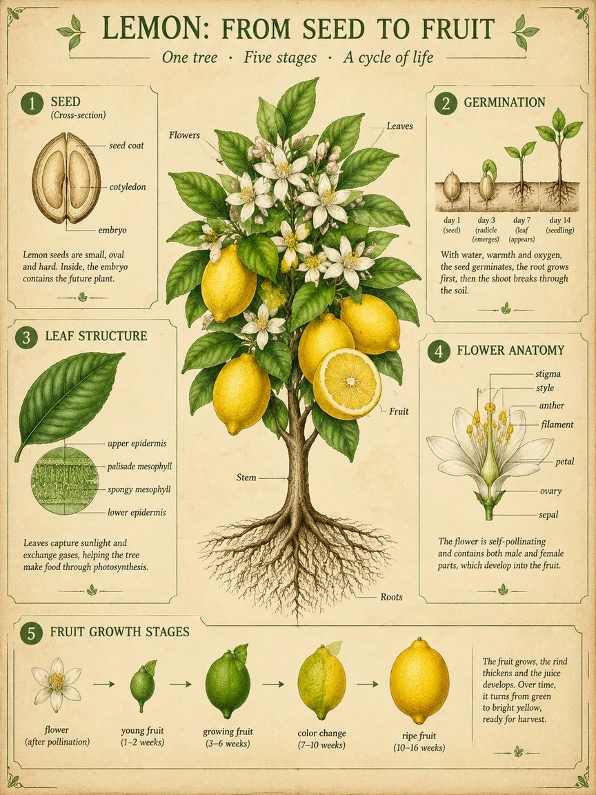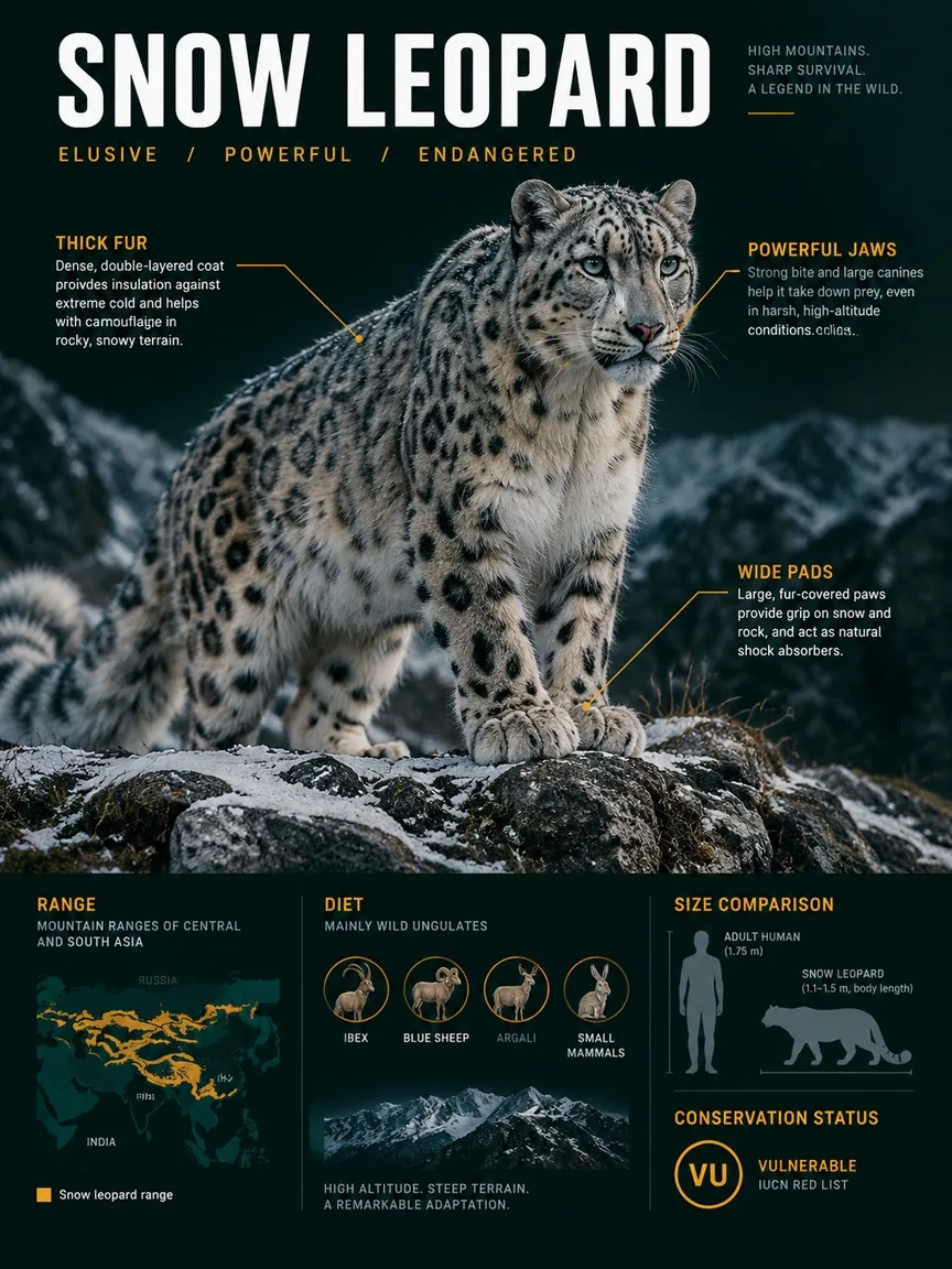

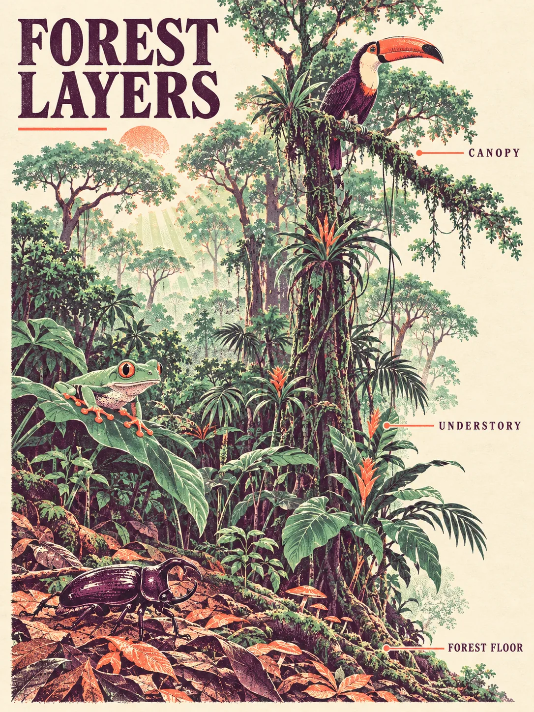
Forest From Below, made with GPT Image 2.5 Sunburst
Example made with GPT Image 2.5 Sunburst

Text to imageInfographics & diagrams

GPT Image 2.5 Sunburst infographic promptForest From Below

The exact text-to-image prompt behind this picture, made with GPT Image 2.5 Sunburst.

Prompt

Vertical 3:4 infographic poster. One continuous rainforest cross-section rises from fallen leaves to tall crowns, with a beetle, tree frog and toucan large enough to read clearly among the foliage. Two-ink risograph illustration in plum and mint on cream paper, coral overprint accents and dappled illustrated daylight. A title reads "FOREST LAYERS"; three quiet leader labels read "CANOPY", "UNDERSTORY" and "FOREST FLOOR", generous open margins, no other text.

Prompts are kept in their original English to help reproduce the example. Copy one as it is, or adapt it for your project.

Opens GPT Image 2.5 Sunburst with this prompt and the settings below filled in.

135 tested GPT Image prompts →

Settings

Mode
Text to image
Aspect ratio
3:4
Quality
high
Price
From 2 credits

The exact price shows before you generate.

Make your own version

  1. The words in quotes, "FOREST LAYERS", are printed in the picture. Keep them short and change them to your own.
  2. Vertical 3:4 infographic poster sets the whole feel of the shot. Swap it for another camera style to change the vibe.

Where this idea comes from

Inspired by an idea from @92digitalartArt, collected in Evolink-AI/awesome-gpt-image-2-API-Prompts under CC0 1.0. PopNow wrote this prompt and made the example above.

Style prompt guide

Style traits to keep

A vertical rainforest cross-section poster, rising from leaf litter to treetop crowns, with a beetle, tree frog and toucan drawn large enough to read. It works because the risograph look is built from just plum, mint, cream paper and coral accents, while the exact label text keeps the infographic clean and readable.

Risograph prints have a recognisable look that comes from limited inks and imperfect layering. Here is how each trait appears in this poster.

Palette
Plum and mint on cream paper keep everything to a small, harmonious set. Coral appears only as an accent, so it draws the eye to details like the toucan's beak.
Texture
Overprint means the two inks overlap into darker shades, with a slightly grainy, matte paper feel. This is what separates it from smooth vector art.
Light
'Dappled illustrated daylight' gives spotted patches of light through leaves, drawn as flat shapes and tone shifts rather than realistic glow.
Composition
A single vertical slice from floor to crown, with open margins, gives a clear reading order. Labels sit beside the layers, so the poster feels designed and uncluttered.

What defines this look

  1. Format and purposeVertical 3:4 infographic poster.

    This sets a tall poster shape and tells the model to build a diagram-like layout, not a loose scene. Remove 'infographic' and you tend to get a plain forest illustration with no layered structure.

  2. Layered structureOne continuous rainforest cross-section rises from fallen leaves to tall crowns

    This defines the bottom-to-top reading order that the three labels depend on. If you drop 'continuous', the forest can split into separate panels or boxes instead of one flowing slice.

  3. Readable animal subjectswith a beetle, tree frog and toucan large enough to read clearly among the foliage.

    Naming one animal per zone gives each layer a focal point. The size cue stops them shrinking into leaves. Remove it and the animals often vanish into the pattern.

  4. Core style recipeTwo-ink risograph illustration in plum and mint on cream paper, coral overprint accents and dappled illustrated daylight.

    Limiting the inks to two plus a coral accent creates the print look, with overlaps forming new tones. Add more colour names and the poster drifts to a generic digital illustration.

  5. Exact text controlA title reads "FOREST LAYERS"; three quiet leader labels read "CANOPY", "UNDERSTORY" and "FOREST FLOOR", generous open margins, no other text.

    Quoted words give the model the precise spelling, and 'quiet' keeps the labels small. 'No other text' blocks invented captions, and the margins leave room for the lettering.

Same style, new subjects

Coastal tide pool

Same style on a marine subject; use it for ocean or nature lessons.

Prompt

Vertical 3:4 infographic poster. One continuous tide pool cross-section rises from sandy seabed to splashing surface, with a crab, starfish and sea anemone large enough to read clearly among the rocks. Two-ink risograph illustration in plum and mint on cream paper, coral overprint accents and dappled illustrated daylight. A title reads "TIDE POOL"; three quiet leader labels read "SURFACE", "ROCKS" and "SAND", generous open margins, no other text.

City street layers

Moves the style into an urban cutaway for a poster about city life.

Prompt

Vertical 3:4 infographic poster. One continuous city street cross-section rises from subway tunnel to rooftops, with a cyclist, a cat on a windowsill and a pigeon large enough to read clearly among the buildings. Two-ink risograph illustration in plum and mint on cream paper, coral overprint accents and soft illustrated daylight. A title reads "CITY LAYERS"; three quiet leader labels read "ROOFTOPS", "STREET" and "SUBWAY", generous open margins, no other text.

Still life shelf

Applies the style to a still life, good for cafe or home-themed prints.

Prompt

Vertical 3:4 infographic poster. One continuous kitchen shelf cross-section rises from bottom drawer to top cupboard, with a teapot, a pear and a ceramic bowl large enough to read clearly among the jars. Two-ink risograph illustration in plum and mint on cream paper, coral overprint accents and soft illustrated window light. A title reads "KITCHEN SHELF"; three quiet leader labels read "TOP", "MIDDLE" and "BOTTOM", generous open margins, no other text.

Model and settings

Keep the 3:4 ratio, since the tall cross-section and its stacked labels depend on vertical space. Keep quality on high, because small text and fine overprint texture need the extra detail. For a wide banner, switch the ratio and rewrite 'rises' as 'spreads', so the layers run sideways. For a square social post, cut the margins request slightly, but keep the quoted text short.

  • Nano Banana ProPick it when you want more labels or captions, since it plans the layout first and handles denser text and diagrams than this three-label poster needs.
  • FLUX.2 ProPick it if you want to fix exact colours: its hex colour control lets you name precise plum, mint and coral values for the risograph palette.

When the style drifts

The style turns into a smooth, generic digital illustration.
Repeat the print traits: add 'visible grain, slight ink misregistration, flat matte fills' and keep the palette to plum, mint and coral only.
The animals shrink into the foliage and are hard to find.
Strengthen the size wording: 'beetle, tree frog and toucan each drawn large, outlined in plum, with open space around them'.
Labels are misspelled, repeated or joined by extra text.
Keep the quotes exactly as written and end with 'no other text'. If extra words persist, shorten the title or remove the 'quiet' wording.
Colours get muddy as the inks overlap into a dark brown mass.
Add 'plenty of cream paper showing through, light mint areas, plum only for outlines and shadows' to keep the layers open.

Questions about this style prompt

What is a risograph look in an AI image prompt?

It refers to prints made with a few flat ink colours that overlap and leave a grainy, slightly imperfect finish. In this prompt, plum and mint inks on cream paper, with coral accents, produce that effect.

How do I get GPT Image 2.5 Sunburst to spell poster text correctly?

Put each word in quotes, say exactly where it appears, and add 'no other text'. This model is known for clean text, so a short title and three labels usually come out spelled correctly.

Can I change the animals in this rainforest poster?

Yes. Swap the beetle, tree frog and toucan for other creatures, such as a sloth or a butterfly. Keep one animal per layer and the 'large enough to read' wording so each stays visible.