
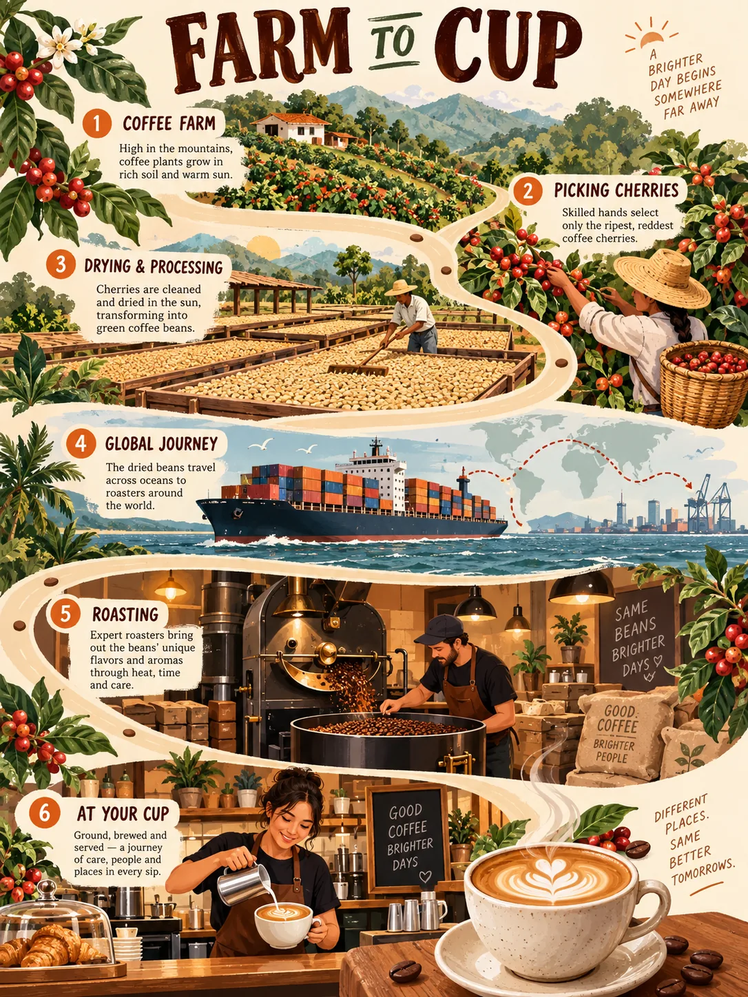
Farm to Cup, made with GPT Image 2.5 Sunburst
Example made with GPT Image 2.5 Sunburst

Text to imageInfographics & diagrams

GPT Image 2.5 Sunburst infographic promptFarm to Cup

The exact text-to-image prompt behind this picture, made with GPT Image 2.5 Sunburst.

Prompt

Vertical 3:4 infographic poster. An illustrated winding path showing how a cup of coffee reaches you, with charming stations along it: a hillside farm, picking cherries, drying beds, a cargo ship, a roastery and a cafe counter, each station with a small label, warm cream background with coffee brown, sage and tangerine, a title at the top that reads "FARM TO CUP".

Prompts are kept in their original English to help reproduce the example. Copy one as it is, or adapt it for your project.

Opens GPT Image 2.5 Sunburst with this prompt and the settings below filled in.

135 tested GPT Image prompts →

Settings

Mode
Text to image
Aspect ratio
3:4
Quality
high
Price
From 2 credits

The exact price shows before you generate.

Make your own version

  1. The words in quotes, "FARM TO CUP", are printed in the picture. Keep them short and change them to your own.
  2. Vertical 3:4 infographic poster sets the whole feel of the shot. Swap it for another camera style to change the vibe.

Where this idea comes from

Inspired by an idea from ZeroLu, collected in ZeroLu/awesome-gpt-image under MIT. PopNow wrote this prompt and made the example above.

Style prompt guide

Style traits to keep

A coffee journey infographic poster unfolds down a winding illustrated trail, tracking beans from volcanic hillsides to an espresso cup. GPT Image 2.5 Sunburst renders clean typography and distinct miniature scenes without cluttering the sequential flow. The ordered list of stations combined with an earthy color scheme keeps every step clear, charming, and readable.

This infographic style balances storybook illustration with educational clarity, giving complex supply chains a gentle, approachable visual rhythm.

Palette
Earthy tints of cream, coffee brown, sage, and tangerine create warm cohesion without the harsh contrast of primary corporate diagram colors.
Composition
A serpentine winding path organizes vertical space from top to bottom, guiding the viewer eye smoothly through chronological milestones.
Line
Clean, storybook vector-style line art outlines each vignette to prevent miniature background details from blurring together.
Era
Mid-century editorial print influences give the poster an artisanal, screen-printed aesthetic rather than a sterile digital chart look.

What defines this look

  1. format and layout typeVertical 3:4 infographic poster.

    Sets the upright canvas and instructs the model to create an organized graphic rather than a photographic landscape. Removing it often results in an unformatted landscape view without infographic structure.

  2. visual progression frameworkAn illustrated winding path showing how a cup of coffee reaches you, with charming stations along it:

    Directs the composition along a serpentine trail so the viewer reads the steps sequentially. Without this, the model tends to scatter random vignettes across the canvas without flow.

  3. narrative milestone lista hillside farm, picking cherries, drying beds, a cargo ship, a roastery and a cafe counter,

    Supplies the specific narrative beats in chronological order. Omitting these steps lets the AI invent repetitive coffee cups or generic foliage instead of the full supply chain.

  4. text integration cueeach station with a small label,

    Prompts the model to anchor short descriptive words beside each scene along the path. If deleted, you get silent cartoon vignettes with no informative annotation.

  5. palette and headerwarm cream background with coffee brown, sage and tangerine, a title at the top that reads "FARM TO CUP".

    Establishes a cohesive retro-editorial color scheme while commanding an explicit headline banner. Changing these hues drastically alters the warm artisanal cafe feel.

Same style, new subjects

Artisan Sourdough Journey

Swaps coffee production for artisan sourdough baking while keeping the serpentine journey aesthetic.

Prompt

Vertical 3:4 infographic poster. An illustrated winding path showing how sourdough bread is baked, with charming stations along it: milling grain, feeding starter, mixing dough, proofing in banneton, dutch oven baking and slicing the loaf, each station with a small label, warm cream background with toasted wheat, sage and terracotta, a title at the top that reads "FLOUR TO LOAF".

Wool Sweater Craft Trail

Applies the illustrated craft trail style to textile garment production.

Prompt

Vertical 3:4 infographic poster. An illustrated winding path showing how a woolen sweater is made, with charming stations along it: sheep pasture, shearing fleece, spinning yarn, botanical dye vats, hand knitting on needles and wearing the finished pullover, each station with a small label, warm cream background with heather brown, sage and ochre, a title at the top that reads "FLEECE TO WEAR".

Rooftop Honey Harvest

Transposes the storybook milestone format into an urban beekeeping and honey harvesting narrative.

Prompt

Vertical 3:4 infographic poster. An illustrated winding path showing how rooftop honey is produced, with charming stations along it: rooftop wildflowers, worker bee foraging, beehive frames, spinning extractor, jar filling and drizzling toast, each station with a small label, warm cream background with honey gold, sage and charcoal, a title at the top that reads "HIVE TO SPOON".

Model and settings

Keep the 3:4 aspect ratio to maintain the tall, vertical orientation required for a downward winding path. Set quality to high so miniature stations and small labels remain crisp and legible rather than smearing. If you switch to a 1:1 square or 16:9 widescreen format, reduce the number of path stations so the horizontal layout does not become cramped.

  • Nano Banana ProNano Banana Pro is ideal if you need strictly organized typography and dense step-by-step layout planning across the whole poster.
  • Nano Banana 2.1Pick Nano Banana 2.1 when you want razor-sharp rendering of miniature text labels and up to 4K resolution clarity on intricate stations.

When the style drifts

The model renders too many chaotic stations, causing labels to become illegible gibberish.
Trim the station list down to four or five core stages and explicitly specify clear, separated illustrated steps.
The style looks like a glossy photorealistic rendering instead of a stylized illustrated poster.
Add flat vector illustration style, screen-printed texture right after the opening format statement.
Background colors turn muddy and drown out the tiny path details.
Replace complex background color names with flat, solid warm cream backdrop with high contrast accents.

Questions about this style prompt

Why are some station labels misspelled or blurry?

Small decorative text can warp when an AI tries to fit too many words into miniature areas. You can fix this by reducing the number of stations in the prompt or keeping each label to a single punchy word like ROAST or BREW.

How can I change the number of steps along the path?

Simply edit the comma-separated list of stations in the prompt. For best readability in a 3:4 vertical frame, keep the total count between four and six distinct milestones.

Can I adapt this layout to a wide horizontal landscape poster?

Yes, change the ratio setting to 16:9 or 4:3 and update the opening line to describe a horizontal timeline or left-to-right river path instead of a vertical winding path.