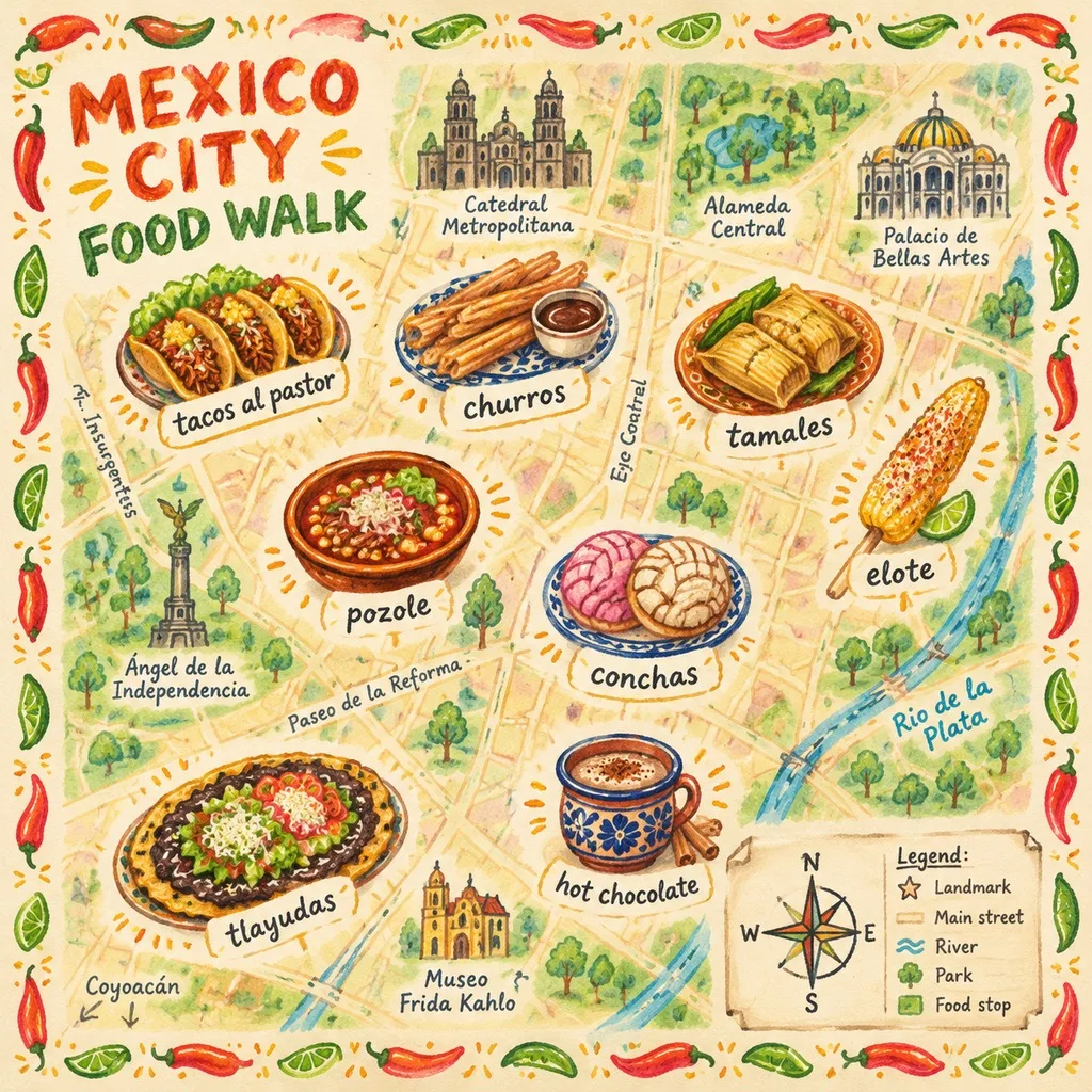
Hand-Drawn Food Map, made with GPT Image 2.5 Sunburst
Example made with GPT Image 2.5 Sunburst

Text to imageInfographics & diagrams

GPT Image 2.5 Sunburst illustrated map promptHand-Drawn Food Map

The exact text-to-image prompt behind this picture, made with GPT Image 2.5 Sunburst.

Fill in the blanks

Change any box and the prompt below updates. Copy it, or make one with your version.

Prompt

A hand-drawn illustrated food map of Mexico City: a simplified bird's-eye city map with main streets, the river and a few landmarks, charming rather than to scale. Spread across it, eight small food illustrations, each with a handwritten name label: tacos al pastor, churros, tamales, elote, pozole, conchas, tlayudas and hot chocolate. A hand-drawn compass and legend in the bottom right, the title "MEXICO CITY FOOD WALK" in chunky hand-lettering at the top left, and a border of doodled chillies and limes. Watercolour and coloured-pencil texture, warm colours.

Prompts stay in English, the language these models follow best. Copy it as it is, or change a few words.

Opens GPT Image 2.5 Sunburst with this prompt and the settings below filled in.

67 tested GPT Image prompts →

Settings

Mode
Text to image
Aspect ratio
1:1
Resolution
1k
Quality
high
Price
From 2 credits

The exact price shows before you generate.

Make your own version

  1. This is a fill-in template: swap the parts in braces, like {foods}, in the boxes above and keep the rest word for word.
  2. The layout is spelled out piece by piece: A hand-drawn compass and legend in the bottom right. Keep that structure and change only the content, or the model loses track of the page.
  3. Watercolour and coloured-pencil texture sets the whole feel of the shot. Swap it for another camera style to change the vibe.
Where this template comes from

Adapted from a prompt by @Panda20230902, collected in freestylefly/awesome-gpt-image-2 under MIT. PopNow rewrote it as a fill-in template and made the example above.

Style prompt guide

Style traits to keep

A hand-drawn food map of Mexico City with a simplified street grid, a river, and eight labelled dishes, from tacos al pastor to hot chocolate, all in a watercolour and coloured-pencil look. It works because GPT Image 2.5 Sunburst handles clean text well, so the handwritten dish names and the chunky title stay readable while the warm, textured style holds across the whole sheet.

The style rests on four visible traits you can see in the result. Each one comes straight from the prompt wording.

Texture
Watercolour and coloured-pencil texture shows as soft wash edges and visible pencil strokes on the paper. It is what separates this from a clean digital infographic.
Palette
Warm colours keep oranges, reds and yellows dominant across the map and the dishes. That warmth makes the street grid and the food feel like one place.
Line
Hand-drawn lines and doodled chillies and limes give loose, uneven outlines. Straight ruler lines would make the map look like a formal city plan.
Lettering
Chunky hand-lettering on the title and handwritten name labels give the sheet a personal, street-vendor feel. Machine-set type would remove the handmade character.

What defines this look

  1. Core format and placeA hand-drawn illustrated food map of Mexico City

    This opening sets the medium and the subject in one breath. Change hand-drawn to a photo or a vector and the result loses the sketchbook feel that the rest of the prompt depends on.

  2. Map base layouta simplified bird's-eye city map with main streets, the river and a few landmarks, charming rather than to scale

    This sets the layout the food sits on. Remove the simplified and charming rather than to scale wording and the model may draw a precise, cluttered street plan that leaves no clear space for the eight labels.

  3. Dish items and labelseight small food illustrations, each with a handwritten name label: tacos al pastor, churros, tamales, elote, pozole, conchas, tlayudas and hot chocolate

    This is the content of the map, with one name per item. Keep the names in the list form shown; if you drop a dish or the labels, the sheet loses its food-guide purpose and the model fills the space with generic drawings.

  4. Title and borderthe title "MEXICO CITY FOOD WALK" in chunky hand-lettering at the top left, and a border of doodled chillies and limes

    The all-caps title gives the sheet a headline, and the doodled border frames it as a menu-style print. Without the border the edges go empty, and without the chunky hand-lettering the title can read as plain type.

  5. Medium and paletteWatercolour and coloured-pencil texture, warm colours

    This is the style that makes the map feel hand-made. Remove it and the image often shifts to flat vector art, while changing warm colours to cool tones would make the food look less appetising.

Same style, new subjects

Baker at a market stall

Swaps the map for one person to test whether the style holds on a face, which suits a bakery card.

Prompt

A hand-drawn illustrated portrait of an adult baker holding a tray of conchas at a market stall, flour on the apron, the tray centred in a simple composition with loose outlines. Watercolour and coloured-pencil texture, warm colours.

Golden dog in a garden

Keeps the warm, soft look of the style on a single animal, and the name tag carries the handwritten label idea over from the map.

Prompt

A hand-drawn illustrated scene of a golden dog sitting in a sunny garden beside a clay pot of marigolds, simple shapes with loose outlines and a small hand-lettered name tag on the collar. Watercolour and coloured-pencil texture, warm colours.

Market lane street view

Moves the same style from a flat bird's-eye map to a street view, which shows how it handles perspective for a travel poster.

Prompt

A hand-drawn illustrated street scene of a Mexico City market lane at midday, colourful stalls and a few tall trees along a cobbled road, simple perspective with the road running into the distance. Watercolour and coloured-pencil texture, warm colours.

Model and settings

Keep the 1:1 ratio, 1k resolution and high quality, since a square sheet suits a map with a border on all sides and high quality keeps the small handwritten labels readable. Stay in text-to-image mode, because the whole map is built from the words alone, with no input picture or start frame. For a poster or a wider print, change the ratio first and recheck every dish label, since text is the first thing to slip. For a quick draft, lower the quality and keep the same wording.

  • Nano Banana ProIts tagline says it plans the layout first, which suits this prompt's mix of a dense map, eight labelled dishes and a title. Pick it if the dish names come out garbled on the first try.
  • Nano Banana 2.1As Google's newest Nano Banana with sharp text, it is the better pick if the handwritten names look soft or blurred in GPT Image 2.5 Sunburst results.

When the style drifts

The watercolour texture fades and the sheet looks like a flat digital map.
Keep Watercolour and coloured-pencil texture at the end of the prompt and add visible paper grain to that wording.
Dish labels come out as squiggles or misspelt words, such as tlayudas or pozole.
Keep each dish name in the list exactly as written, and if labels still break, try Nano Banana Pro from the alternatives.
The map becomes a precise street plan that leaves no room for the eight dishes.
Keep simplified and charming rather than to scale in the map sentence, and add with plenty of open space for food if the streets crowd the items.
The colours turn muddy and brown, which makes the food look unappetising.
Keep warm colours and remove any extra colour words, and avoid adding a dark or grey mood word.

Questions about this style prompt

Can I use this Mexico City food map prompt for a different city?

Yes, change Mexico City in the first sentence, the landmarks in the map sentence and the title, then swap the dish list for local foods. Keep the handwritten labels and the watercolour wording so the style stays the same.

Why are some dish names spelled wrong in my GPT Image 2.5 Sunburst result?

Multi-word names, such as tacos al pastor and hot chocolate, are the hardest for the model to draw correctly. Generate at high quality, keep names in the exact list spelling, and regenerate the image if only one label is off.

Which ratio should I pick for a printed version of this food map?

Keep the 1:1 ratio for a square sheet, or change the ratio before you generate if your print needs a different shape. Check the labels at 1k first, then raise the resolution only if the text still reads clearly.