

Motion Design AI Art Generator: Editorial Motion Frame
A still image with the graphic rhythm of a motion-design sequence.
- From a description only
- Best shape: 3:4 · 4:5 · 1:1
Works on
- Seedream 5.0 Pro
- Qwen Image 3.0
- Nano Banana 2.1
- Seedream 5.0 Flash
About Editorial Motion Frame
Editorial Motion Frame makes a still composition feel ready to move. Flat shapes overlap with purpose, a limited palette establishes hierarchy, and subtle texture prevents the color fields from feeling sterile. Its roots are in editorial illustration and motion design, where a visual metaphor needs to read quickly. Shadows follow a consistent direction, while diagonals, repeated forms, and carefully spaced gaps suggest timing without relying on motion blur.
Use a written description to turn an idea into a physical scene. A commuter stepping between oversized stepping stones can suggest progress; a gardener balancing sun and rain can suggest care. A worker sorting differently shaped blocks or a cyclist passing through overlapping circles also gives the composition useful rhythm. Describe the central action and the relationship between shapes. One metaphor is usually enough to organize the whole frame.
Consider “a commuter stepping across three oversized stones toward a bright doorway” or “a gardener balancing a sun-shaped disk and a blue rain cloud.” For a more practical scene, try “a worker sorting red and cream blocks into a neat stack.” Changing the scale of the surrounding shapes changes the emphasis: large obstacles make the figure seem challenged, while smaller shapes make the same action feel light and playful.
Tips
- Choose one metaphor, such as balance or progress, and give it a visible action rather than several symbols.
- Repeat a shape at different sizes to create a sense of sequence across the still frame.
- Use one accent color for the moving subject so overlapping background forms do not steal attention.
- Keep cast shadows pointing together; inconsistent directions can make layered geometry hard to understand.
- A square composition works well for a central balancing scene, while 3:4 suits an upward stepping action.
What the style adds
Your words go where it says “your subject”. Everything else is added for you.
your subject. Create one original editorial animation frame with layered geometric shapes, purposeful overlap and a clear visual metaphor. Use a limited palette, subtly textured flat fills and consistent shadow logic. Imply movement through composition rather than blur, without interface chrome, labels or unrelated decorative icons.
Models and price
- Seedream 5.0 Pro36 credits
- Qwen Image 3.030 credits
- Nano Banana 2.148 credits
- Seedream 5.0 Flash29 credits
One 1K image from a description. The button always shows the exact price before you spend anything.
How to use Editorial Motion Frame
- Describe itWrite who or what should be in the picture. A small action and a clear place work best.
- Pick a shapeKeep the suggested ratio and model, or change them in the bar at the bottom.
- Paint itPress “Paint it”. The price is on the button before you spend anything.
Questions about Editorial Motion Frame
Can I use Editorial Motion Frame on my own photo?
Not yet. This style works from a description: write what you want to see and the style adds the look.
How much does one Editorial Motion Frame image cost?
29 credits for one 1K image on Seedream 5.0 Flash. 2K costs more, and the button shows the exact price before you run it.
Does the image actually move?
The generated image is a still frame. Directional shapes, overlap, and spacing imply movement within it. You can then choose a video effect if you want to develop that sense of motion into an animated result.
How does this compare with Ligne Claire Travel?
Ligne Claire Travel describes places through even contours and orderly perspective. Editorial Motion Frame simplifies the world into overlapping graphic forms, often using unusual scale or visual metaphor to communicate an idea quickly.
Should I include words to explain my idea?
A concrete metaphor is more useful than a headline here. Describe a person bridging a gap, balancing objects, or organizing shapes. Those relationships let the illustration communicate visually without depending on readable lettering.
Similar styles
 Animation Background GouacheHand-painted environmental depth with deliberate color staging.
 Limited CelEconomical painted shapes with a strong held-pose silhouette.
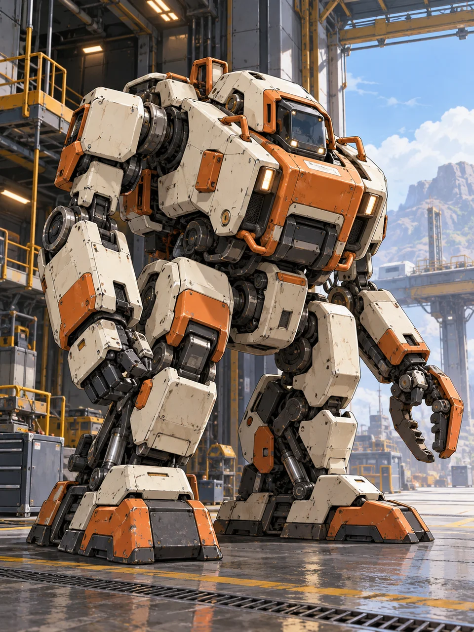 Industrial MechaFunctional mechanical design with crisp cel-painted planes.
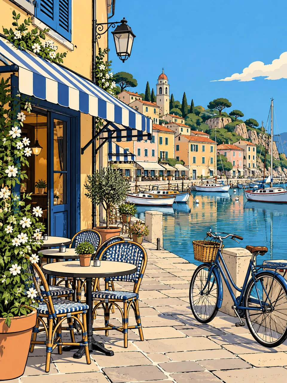 Ligne Claire TravelEven outlines and clear color make every spatial detail readable.
Bring it to life
Effects that turn a still in this look into a short video.
 Slider Parallax
 Pop-Up Book