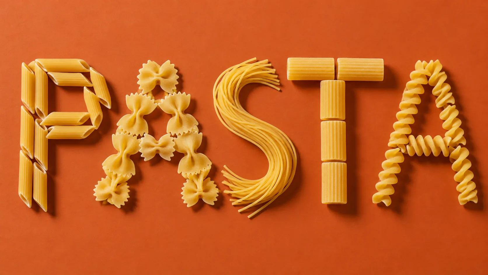
Pasta Lettering, made with GPT Image 2.5 Sunburst
Example made with GPT Image 2.5 Sunburst

Text to imageArt & posters

GPT Image 2.5 Sunburst typography promptPasta Lettering

The exact text-to-image prompt behind this picture, made with GPT Image 2.5 Sunburst.

Prompt

Wide 16:9 landscape frame. The word "PASTA" spelled out with real dried pasta shapes arranged neatly on a terracotta orange background, each letter built from a different shape: penne, farfalle, spaghetti, rigatoni and fusilli, top-down studio photography with crisp shadows, clean and witty, no other text.

Prompts are kept in their original English to help reproduce the example. Copy one as it is, or adapt it for your project.

Opens GPT Image 2.5 Sunburst with this prompt and the settings below filled in.

135 tested GPT Image prompts →

Settings

Mode
Text to image
Aspect ratio
16:9
Quality
high
Price
From 2 credits

The exact price shows before you generate.

Make your own version

  1. The words in quotes, "PASTA", are printed in the picture. Keep them short and change them to your own.
  2. For a different mood, rewrite only the light: top-down studio photography with crisp shadows.

Style prompt guide

Style traits to keep

Dried pasta shapes arranged into bold typography create a playful graphic poster on a warm terracotta surface. GPT Image 2.5 Sunburst renders the distinct ridges, twists, and brittle edges of each noodle type while keeping the letterforms sharply legible. The combination of top-down studio lighting and high-contrast color yields an editorial still-life aesthetic that looks crisp even at full display sizes.

This flat-lay food art style relies on geometric order, tactile surfaces, and deliberate color pairing to make pantry staples look like high-end graphic design.

Composition
Knolled typographic alignment structures organic ingredients into straight, evenly spaced letterforms across a horizontal plane.
Palette
Warm terracotta orange sets off pale semolina gold, creating saturated editorial contrast without visual noise.
Texture
Brittle edges, flour dusting, and ridged contours provide tactile realism that separates raw food art from flat vectors.
Light
Direct overhead studio lighting casts hard, defined drop shadows beneath each noodle, giving the text physical depth.

What defines this look

  1. composition and word baselineWide 16:9 landscape frame. The word "PASTA" spelled out

    It locks the panoramic canvas orientation and commands the generator to assemble an exact five-letter word. Omitting it risks an unorganized scatter of noodles without readable typography.

  2. medium and color fieldwith real dried pasta shapes arranged neatly on a terracotta orange background,

    This establishes the tangible dry food medium and provides a warm, complementary surface tone. Swapping the background to a pale color lowers visual contrast and weakens the graphic poster punch.

  3. ingredient mapping specificationeach letter built from a different shape: penne, farfalle, spaghetti, rigatoni and fusilli,

    It assigns specific geometric dried noodles to each respective letter slot to prevent repetitive textures. Removing this phrase causes the AI to default to generic, identical noodle piles.

  4. camera perspective and lightingtop-down studio photography with crisp shadows, clean and witty, no other text.

    This ensures an overhead flat-lay perspective with sharp lighting that casts hard drop shadows under the noodles. Without it, the model may tilt the camera or add unwanted food packaging labels.

Same style, new subjects

Coffee bean typography

Applies the typographic food arrangement style to roasted coffee beans on a pastel surface for a cafe wall art print.

Prompt

Wide 16:9 landscape frame. The word "COFFEE" spelled out with whole roasted dark coffee beans arranged neatly on a pastel mint green background, top-down studio photography with crisp shadows, clean and witty, no other text.

Pet kibble silhouette

Translates the dry ingredient knolling style into a crisp animal silhouette for pet care packaging or posters.

Prompt

Wide 16:9 landscape frame. A stylized silhouette of a cat arranged neatly from crunchy dry pet kibble on a deep navy blue background, top-down studio photography with crisp shadows, clean and witty, no other text.

Sewing notions portrait

Applies the knolled object style to tailoring tools to form an elegant human profile on a neutral background.

Prompt

Wide 16:9 landscape frame. A side profile silhouette of an adult woman's face neatly assembled from silver sewing needles, colorful spools of thread, and brass thimbles on a smooth cream background, top-down studio photography with crisp shadows, clean and witty, no other text.

Model and settings

Keep the 16:9 aspect ratio because spelling out horizontal lettering needs wide horizontal margins so individual shapes do not crowd the edges. Set quality to high to resolve the micro-textures of noodle ridges and brittle edges cleanly. Run in text-to-image mode without input pictures so the model builds fresh geometry from scratch. If repurposing this graphic style for a square profile avatar, switch the ratio to 1:1.

  • Nano Banana ProPick Nano Banana Pro if you want to extend the word into a multi-line quote, taking advantage of its strength in planning layouts first for dense text.
  • FLUX.2 ProChoose FLUX.2 Pro when you need strict hex color control over the terracotta backdrop alongside readable photoreal typography.

When the style drifts

The noodles look cooked, wet, and saucy instead of hard and dry.
Ensure the words 'real dried pasta shapes' remain in the prompt, and remove any culinary terms like 'fresh', 'plated', or 'cooked'.
Muddy tones where the orange background visually blends with the yellow noodles.
Change the background description to 'vibrant matte terracotta orange background with bright studio key light' to force strong tonal separation.
The letter shapes lose their sharp outlines due to shallow depth of field.
Replace 'top-down studio photography' with 'deep-focus overhead flat-lay photography with every shape fully sharp'.

Questions about this style prompt

Why did the letters merge into an illegible noodle pile?

AI generators struggle when letterforms sit too close together. Keeping the word short like 'PASTA' and listing distinct pasta shapes gives the model clear structural boundaries to keep each character separate.

Can I swap the pasta types for different shapes?

Yes. You can swap in varieties like orecchiette, cavatappi, or ditalini, but choose shapes with distinct outer silhouettes so the letter contours remain immediately recognizable.

How do I prevent the model from adding ceramic bowls or forks?

The phrase 'no other text' helps, but you can strengthen it by writing 'spelled out directly on a flat surface with no plates, bowls, or utensils' to keep the layout minimalist.