
Morning Routine Riso, made with GPT Image 2.5 Sunburst
Example made with GPT Image 2.5 Sunburst

Text to imageArt & posters

GPT Image 2.5 Sunburst art style promptMorning Routine Riso

The exact text-to-image prompt behind this picture, made with GPT Image 2.5 Sunburst.

Prompt

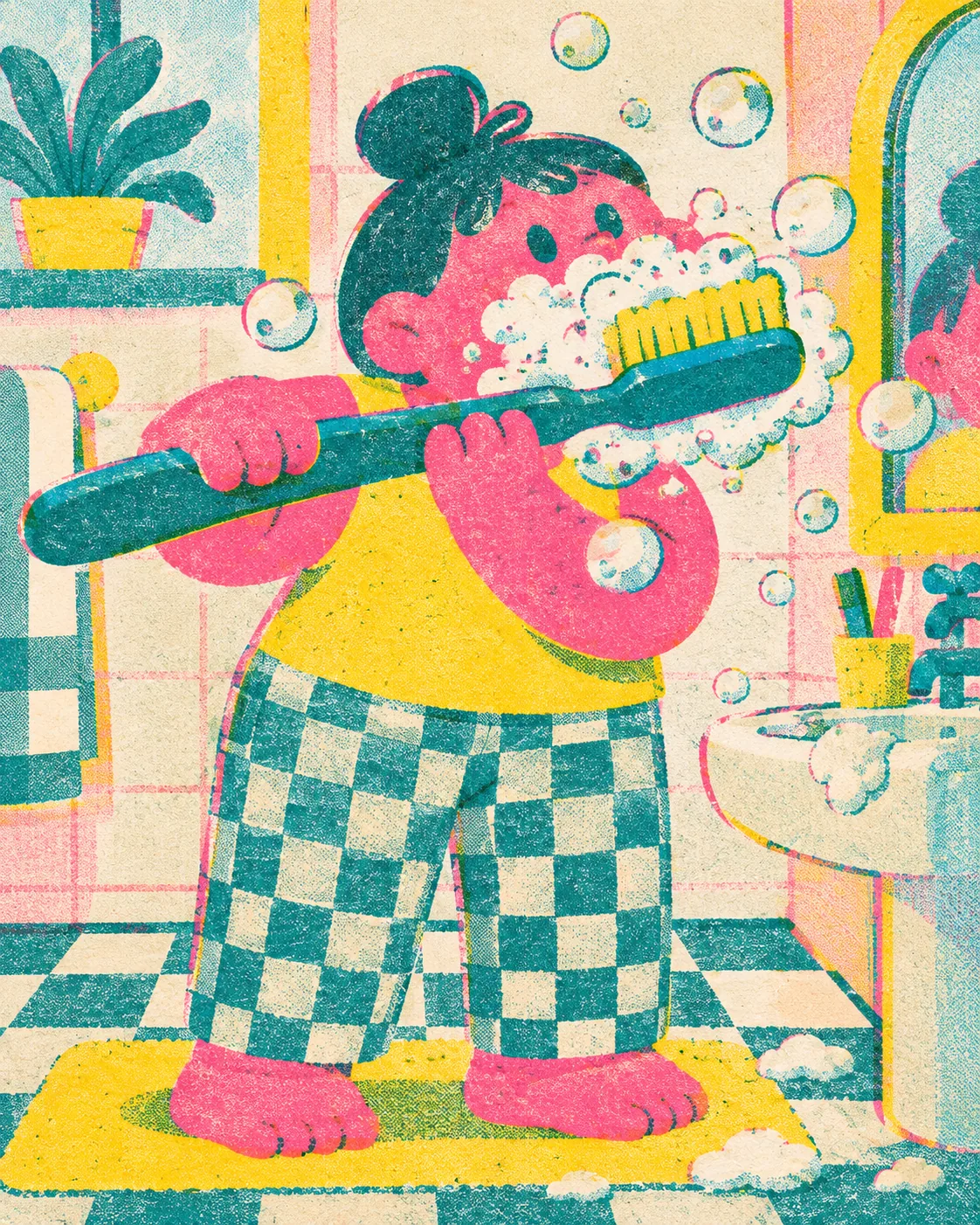
Vertical 4:5 portrait frame. A three-ink risograph print of a chunky rounded cartoon person brushing their teeth with an absurdly oversized toothbrush, foam bubbles floating around, printed in fluorescent pink, teal and yellow with visible grain, slight misregistration and overprint, playful and modern, no text.

Prompts are kept in their original English to help reproduce the example. Copy one as it is, or adapt it for your project.

Opens GPT Image 2.5 Sunburst with this prompt and the settings below filled in.

135 tested GPT Image prompts →

Settings

Mode
Text to image
Aspect ratio
4:5
Quality
high
Price
From 2 credits

The exact price shows before you generate.

Make your own version

  1. The prompt ends with no text. Leave that in, or the model may add random lettering.

Where this idea comes from

Inspired by an idea from @VigoCreativeAI, collected in VigoZhao/AI-Visual-Prompt-Cookbook under CC BY 4.0. PopNow wrote this prompt and made the example above.

Style prompt guide

Style traits to keep

A chunky cartoon character brushing their teeth comes alive through high-contrast graphic poster art. GPT Image 2.5 Sunburst renders authentic spot-color printing by separating flat tones, adding speckle noise, and introducing gentle color plate misalignment. Limiting the palette to three bright inks keeps the composition graphic and crisp, avoiding the slick gradients of generic digital vectors.

Risograph prints gain their vintage charm through the mechanical imperfections of stencil duplication and translucent ink layers.

Palette
Fluorescent pink, teal, and yellow form discrete color blocks that mimic neon spot inks rather than soft photographic blends.
Texture
Visible grain breaks up flat areas with micro-dots, simulating porous soy ink settling into unbaked paper stock.
Line
Chunky, bold contours separate color fills, ensuring shapes stay legible despite deliberate mechanical slippage.
Layering
Misregistration and overprint allow colors to cross borders slightly, creating accidental third colors where transparent inks overlap.

What defines this look

  1. format and medium setupVertical 4:5 portrait frame. A three-ink risograph print of

    It establishes the poster proportions and forces the generator to emulate physical stencil duplication instead of standard 3D rendering or photography.

  2. subject and focal actiona chunky rounded cartoon person brushing their teeth with an absurdly oversized toothbrush,

    It defines the playful silhouette and oversized prop, keeping character details simple enough to work within flattened screen-print shapes.

  3. palette and accent elementsfoam bubbles floating around, printed in fluorescent pink, teal and yellow

    It sets the secondary scene details and restricts the ink channels to three specific shades, preventing the model from introducing muddy secondary hues.

  4. texture and mechanical defectswith visible grain, slight misregistration and overprint, playful and modern, no text.

    It introduces authentic paper grain, mechanical plate overlap, and overlapping color shifts while suppressing unwanted AI typography.

Same style, new subjects

Sunbasking Cat

Transfers the punchy three-ink aesthetic to a cozy domestic pet portrait.

Prompt

Vertical 4:5 portrait frame. A three-ink risograph print of a plump loafing domestic cat dozing on a retro windowsill with potted houseplants, printed in fluorescent pink, teal and yellow with visible grain, slight misregistration and overprint, playful and modern, no text.

Morning Coffee Still Life

Applies the limited spot-color print style to an energetic culinary tabletop setup.

Prompt

Vertical 4:5 portrait frame. A three-ink risograph print of an overflowing moka pot, a speckled ceramic mug, and a flaky croissant on a checkered kitchen table, printed in fluorescent pink, teal and yellow with visible grain, slight misregistration and overprint, playful and modern, no text.

Bicycle Commute

Adapts the graphic printmaking approach to an urban street scene with multiple layers.

Prompt

Vertical 4:5 portrait frame. A three-ink risograph print of an adult cyclist carrying a bouquet of flowers in a front basket past stylized shop awnings, printed in fluorescent pink, teal and yellow with visible grain, slight misregistration and overprint, playful and modern, no text.

Model and settings

Keep the aspect ratio set to 4:5 to maintain standard vertical art print proportions that frame single characters neatly. Switch to 1:1 if you are generating icons or social feed squares, or 16:9 for desktop backgrounds. High quality should remain active because the fine speckle grain, halftone dot patterns, and subtle misregistration lines require maximum clarity to avoid looking like smeared compression noise.

  • FLUX.2 ProChoose FLUX.2 Pro when you need exact control over spot colors via hex color values and want clean separation between paper stock and ink layers.

When the style drifts

The artwork renders like a smooth 3D render or glossy airbrush vector instead of a printed page.
Strengthen texture cues by replacing playful and modern with flat shapes, heavy paper texture, and screen-printed halftone screen.
Colors blend into murky greens, dark purples, or brown gradients across the character.
Remove overlapping props and specify separated flat spot colors with hard white paper borders to stop unwanted digital gradients.
The model generates unreadable pseudo-text, poster labels, or mock magazine logos.
Move no text to the very start of the prompt and replace it with blank background, completely free of typography, logos, or captions.

Questions about this style prompt

Why does my risograph print look too smooth?

Models default to clean digital art unless pushed toward mechanical flaws. Reinforce texture by adding phrases like unbleached newsprint paper texture and coarse halftone dot grain to your description.

Can I add more ink colors without ruining the style?

Limiting the count to two or three inks preserves the authentic stencil aesthetic. If you introduce a fourth ink, name it specifically and request separated spot inks so colors do not dissolve into a full-color photo mix.

How do I make the color overlap look more authentic?

Emphasize phrases like translucent ink overprinting and offset stencil alignment. This prompts the model to generate recognizable secondary hues specifically where pink, yellow, and teal physically overlap on the page.