Good Company Letters, made with GPT Image 2.5 Sunburst
Example made with GPT Image 2.5 Sunburst

Text to imageArt & posters

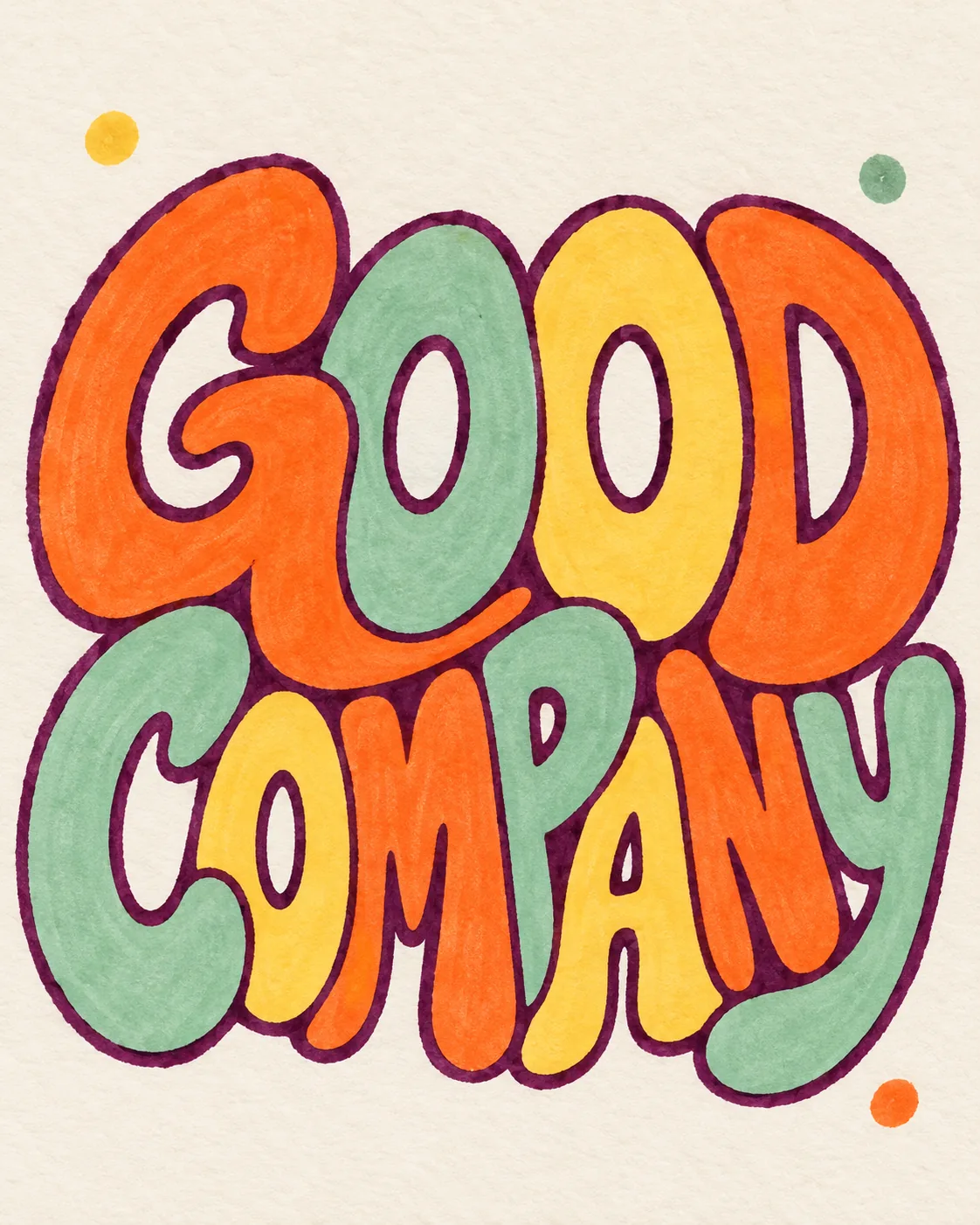
GPT Image 2.5 Sunburst typography promptGood Company Letters

The exact text-to-image prompt behind this picture, made with GPT Image 2.5 Sunburst.

Prompt

Vertical 4:5 portrait frame. A hand-lettered composition reading "GOOD COMPANY" fills the center of cream toothy paper with chunky interlocking letters, plum marker outlines and alternating tangerine, mint and butter yellow fills. Letter counters remain generous and legible, with only three small abstract dots in the margins. Flat scanned illustration, subtle ink bleed and uneven edges, cheerful contemporary print-shop energy with carefully balanced negative space, no other text.

Prompts are kept in their original English to help reproduce the example. Copy one as it is, or adapt it for your project.

Opens GPT Image 2.5 Sunburst with this prompt and the settings below filled in.

135 tested GPT Image prompts →

Settings

Mode
Text to image
Aspect ratio
4:5
Quality
high
Price
From 2 credits

The exact price shows before you generate.

Make your own version

  1. The words in quotes, "GOOD COMPANY", are printed in the picture. Keep them short and change them to your own.
  2. Flat scanned illustration sets the whole feel of the shot. Swap it for another camera style to change the vibe.
Where this idea comes from

Inspired by an idea from @VigoCreativeAI, collected in VigoZhao/AI-Visual-Prompt-Cookbook under CC BY 4.0. PopNow wrote this prompt and made the example above.

Style prompt guide

Style traits to keep

Hand-drawn typography creates a warm, retro-inspired art print featuring bold lettering on textured cream paper. GPT Image 2.5 Sunburst pairs precise character rendering with tactile marker bleed and interlocking shapes to prevent sterile vector artifacts. The strict color list and negative space cues keep the design clean, cheerful, and legible.

This print-shop illustration style merges mid-century screenprint tactility with modern boutique poster graphic design.

Palette
Tangerine, mint, and butter yellow on cream paper provide a warm, optimistic print feel anchored by deep plum lines instead of harsh black.
Line and Ink
Hand-drawn plum marker outlines with subtle ink bleed simulate physical risograph or screen-printed art on toothy paper.
Letterform Structure
Chunky, interlocking characters maximize weight while keeping open counter spaces to maintain immediate readability.
Composition
A centered visual mass surrounded by generous breathing room and minimal margin dots creates a deliberate, professional poster layout.

What defines this look

  1. Layout framingVertical 4:5 portrait frame.

    Sets the orientation to vertical poster proportions. Removing it can produce squarer dimensions that cramp vertical lettering stacks.

  2. Core subject and substrateA hand-lettered composition reading "GOOD COMPANY" fills the center of cream toothy paper

    Specifies the exact target words and grounds the piece on textured, off-white stock. Changing this phrase alters the primary text and background warmth.

  3. Letterform styling and palettewith chunky interlocking letters, plum marker outlines and alternating tangerine, mint and butter yellow fills.

    Defines the graphic look, line color, and tri-color scheme. Removing plum outlines can lead to weak contrast, while altering colors shifts the sunny mood.

  4. Legibility and minimal accentsLetter counters remain generous and legible, with only three small abstract dots in the margins.

    Prevents the chunky overlapping letters from closing up holes in letters like O and P. It also restrains decorative clutter in the borders.

  5. Medium and negative spaceFlat scanned illustration, subtle ink bleed and uneven edges, cheerful contemporary print-shop energy with carefully balanced negative space, no other text.

    Enforces a physical print look with organic imperfections rather than digital gloss. The negative space instruction stops the model from filling empty areas with random doodles.

Same style, new subjects

Morning ritual poster

Applies the print-shop marker style and colorway to a morning coffee still life and short tagline.

Prompt

Vertical 4:5 portrait frame. A hand-lettered composition reading "FRESH ROAST" above a stylized ceramic coffee mug fills the center of cream toothy paper with chunky interlocking letters, plum marker outlines and alternating tangerine, mint and butter yellow fills. Letter counters remain generous and legible, with small steam swirls in the margins. Flat scanned illustration, subtle ink bleed and uneven edges, cheerful contemporary print-shop energy with carefully balanced negative space, no other text.

Potted monstera art print

Translates the chunky marker outline aesthetic onto a botanical poster subject while retaining the tri-color palette.

Prompt

Vertical 4:5 portrait frame. An illustrated botanical composition featuring a potted monstera leaf reading "GROW WILD" across the terracotta pot fills the center of cream toothy paper with chunky interlocking shapes, plum marker outlines and alternating tangerine, mint and butter yellow fills. Contours remain clean and open, with three small abstract dots in the margins. Flat scanned illustration, subtle ink bleed and uneven edges, cheerful contemporary print-shop energy with carefully balanced negative space, no other text.

Coastal travel typography

Uses the style for a travel-themed typographic print combining text and simple geometric landscape shapes.

Prompt

Vertical 4:5 portrait frame. A hand-lettered composition reading "PACIFIC SUN" over a minimalist setting sun fills the center of cream toothy paper with chunky interlocking letters, plum marker outlines and alternating tangerine, mint and butter yellow fills. Letter counters remain generous and legible, with subtle wave curves in the margins. Flat scanned illustration, subtle ink bleed and uneven edges, cheerful contemporary print-shop energy with carefully balanced negative space, no other text.

Model and settings

Keep the aspect ratio set to 4:5 to maintain standard vertical art print proportions that allow centered lettering to breathe naturally. Set quality to high so GPT Image 2.5 Sunburst renders crisp letter boundaries and authentic paper tooth texture without blur. If you want a desktop wallpaper or horizontal banner, switch the ratio to 16:9 while retaining high quality to preserve text clarity across wide negative space.

  • Nano Banana ProChoose Nano Banana Pro when you want to add longer paragraphs or complex secondary subtext, as its layout-first engine arranges dense typography cleanly.
  • FLUX.2 ProPick FLUX.2 Pro if you need exact brand hex color matching for the fills while maintaining clear, readable lettering.

When the style drifts

Lettering becomes illegible because chunky shapes close up internal spaces like the loops in O or P.
Ensure the prompt explicitly includes "generous legible letter counters" and avoid words with more than twelve characters.
The illustration renders as a slick, hyper-smooth vector graphic without physical texture.
Keep explicit physical keywords like "cream toothy paper", "subtle ink bleed", and "flat scanned illustration" to force paper grain.
Extra random words, gibberish letters, or busy background doodles appear in the margins.
Keep "no other text" at the end and strictly limit decorative accents to "three small abstract dots in the margins".

Questions about this style prompt

How do I change the text while keeping this exact lettering style?

Replace "GOOD COMPANY" with your own two-word or three-word phrase inside quotation marks. Keep the phrase short, ideally under twelve total characters, so the letters remain chunky, interlocking, and legible without overcrowding the frame.

Why does the prompt use plum marker outlines instead of pure black?

Deep plum outlines soften high digital contrast, giving the print an organic risograph or boutique screenprint appearance. Pure black outlines often look like harsh vector clip art, whereas dark plum harmonizes warmly with cream paper and pastel fills.

Can I switch the color palette without losing the hand-printed look?

Yes, replace tangerine, mint, and butter yellow with three complementary shades like terracotta, sage, and mustard. Keep the outline color dark and distinct from the fills, and retain "cream toothy paper" to maintain the paper texture.