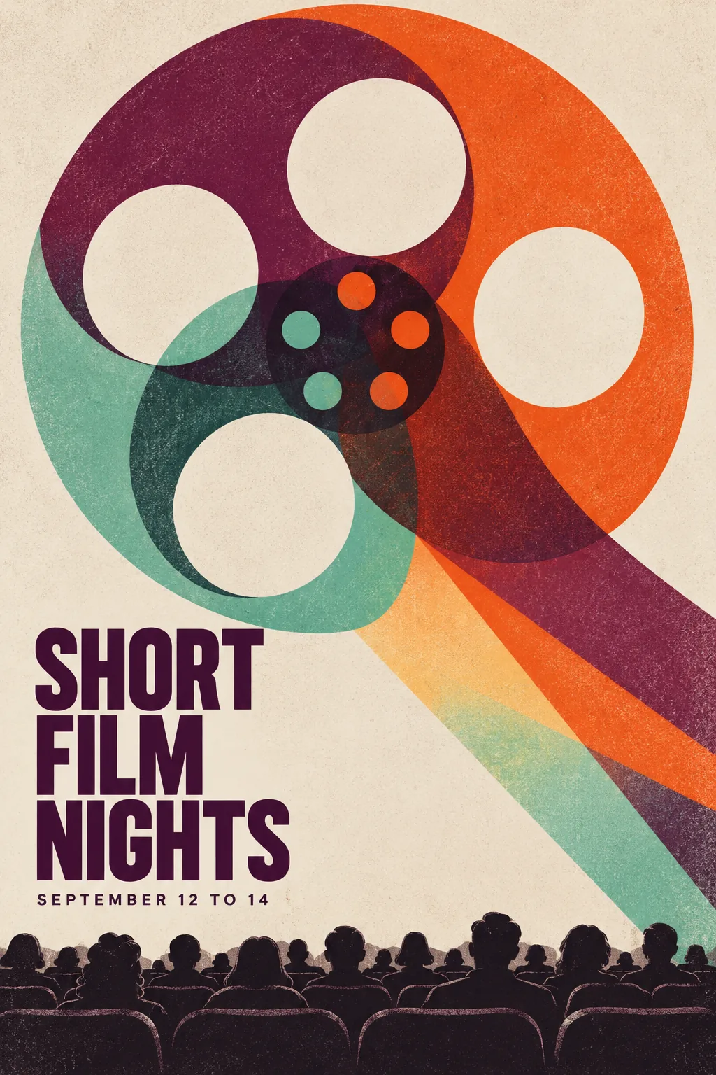
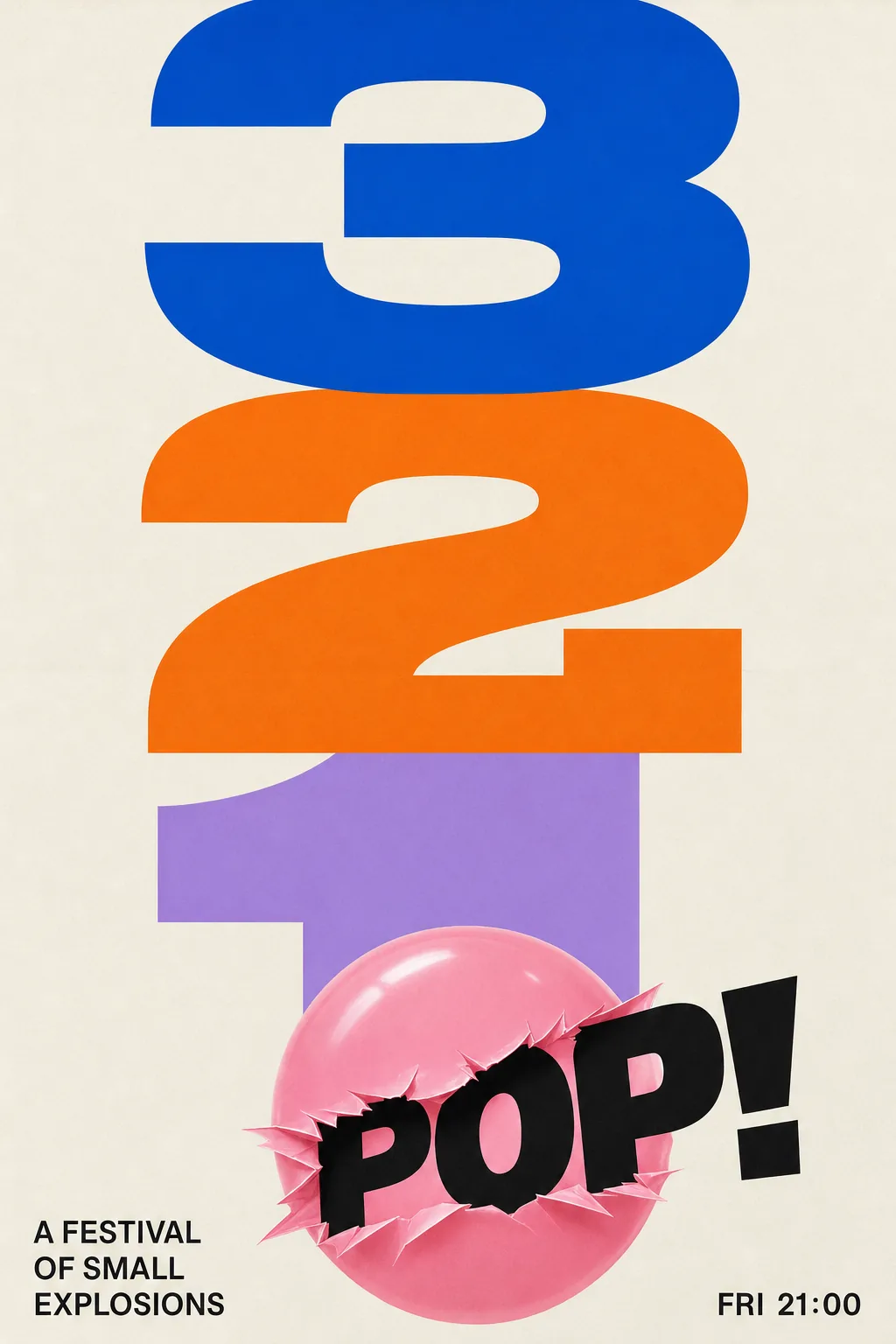
Film Festival Poster, made with GPT Image 2.5 Sunburst
Example made with GPT Image 2.5 Sunburst

Text to imageArt & posters

GPT Image 2.5 Sunburst poster design promptFilm Festival Poster

The exact text-to-image prompt behind this picture, made with GPT Image 2.5 Sunburst.

Prompt

Vertical 2:3 poster frame. A modern film festival poster with a large abstract shape of a film reel made from overlapping translucent circles in plum, tangerine and mint, a tiny silhouette of an audience at the bottom, title that reads "SHORT FILM NIGHTS", a small line that reads "SEPTEMBER 12 TO 14", grainy print texture, bold minimal composition, no other text.

Prompts are kept in their original English to help reproduce the example. Copy one as it is, or adapt it for your project.

Opens GPT Image 2.5 Sunburst with this prompt and the settings below filled in.

135 tested GPT Image prompts →

Settings

Mode
Text to image
Aspect ratio
2:3
Quality
high
Price
From 2 credits

The exact price shows before you generate.

Make your own version

  1. The words in quotes, "SHORT FILM NIGHTS", are printed in the picture. Keep them short and change them to your own.
  2. Vertical 2:3 poster frame sets the whole feel of the shot. Swap it for another camera style to change the vibe.
Style prompt guide

Style traits to keep

A minimalist graphic film festival poster balances bold abstract geometry with precise typography. Overlapping translucent circles in retro-modern tones create visual depth while establishing a clear screen-printed aesthetic. GPT Image 2.5 Sunburst executes crisp, legible lettering alongside flat silhouettes to deliver a professional design ready for print.

This style replicates mid-century modern screenprinting through bold geometric abstraction, restrained color overlays, and tactile print grain.

Palette
Translucent overlapping plum, tangerine, and mint produce secondary blended tones that mimic traditional multi-pass ink printing.
Texture
A subtle risograph-like paper grain softens flat digital vector shapes to evoke authentic physical poster paper.
Composition
A large hero shape dominates the upper frame, contrasted with expansive negative space and tiny scale silhouettes near the bottom.
Typography
Clean sans-serif lettering provides crisp editorial hierarchy without distracting from the central geometric illustration.

What defines this look

  1. Format and themeVertical 2:3 poster frame. A modern film festival poster with

    Sets the vertical layout and establishes the modern cultural event aesthetic. Removing this may lead to unstyled, generic cinematic scenes instead of a flat graphic design.

  2. Central graphic motifa large abstract shape of a film reel made from overlapping translucent circles in plum, tangerine and mint,

    Defines the primary visual focal point and specifies the sophisticated three-color screenprint palette. Changing the colors will alter the retro mid-century modern aesthetic entirely.

  3. Scale and groundinga tiny silhouette of an audience at the bottom,

    Adds a sense of massive scale and context by anchoring the bottom of the poster. Without it, the composition feels like a purely geometric abstract illustration rather than an event banner.

  4. Typography and hierarchytitle that reads "SHORT FILM NIGHTS", a small line that reads "SEPTEMBER 12 TO 14",

    Directs the model to generate exact festival copy with a headline and secondary date line. Altering the text strings lets you adapt the poster for different events or dates.

  5. Finish and constraintgrainy print texture, bold minimal composition, no other text.

    Applies a tactile risograph or silkscreen grain and prevents the AI from cluttering the negative space with gibberish credits or unwanted branding.

Same style, new subjects

Jazz festival poster

Applies the overlapping translucent screenprint aesthetic to a music festival featuring a bold horn motif.

Prompt

Vertical 2:3 poster frame. A modern jazz festival poster with a large abstract shape of a saxophone made from overlapping translucent circles in indigo, amber and sage, a tiny silhouette of a pianist at the bottom, title that reads "MIDNIGHT JAZZ FEST", a small line that reads "OCTOBER 5 TO 7", grainy print texture, bold minimal composition, no other text.

Architecture exhibition poster

Swaps the curved film reel for sharp angular architectural geometry while preserving the minimalist print finish.

Prompt

Vertical 2:3 poster frame. A modern architecture exhibition poster with a large abstract shape of a cantilever building made from overlapping translucent geometric polygons in cobalt, terracotta and olive, a tiny silhouette of pedestrians at the bottom, title that reads "URBAN FORMS EXPO", a small line that reads "NOVEMBER 18 TO 22", grainy print texture, bold minimal composition, no other text.

Dance performance poster

Uses fluid geometric overlays to represent contemporary dance movement in the same clean graphic layout.

Prompt

Vertical 2:3 poster frame. A modern dance performance poster with a large abstract shape of a leaping dancer made from overlapping translucent fluid arcs in crimson, mustard and dusty teal, a tiny silhouette of theater seats at the bottom, title that reads "MOTION THEATER", a small line that reads "DECEMBER 1 TO 3", grainy print texture, bold minimal composition, no other text.

Model and settings

Stick to the default 2:3 aspect ratio, which mirrors standard event posters and gives typography and abstract shapes plenty of vertical breathing room. Set quality to high so letterforms render cleanly without blurred glyphs. If you adapt this style for square social graphics, switch to a 1:1 ratio, but keep titles short to avoid crowding the narrower frame.

  • Nano Banana ProNano Banana Pro is a strong alternative when you need to add longer sponsor lists, festival director credits, or complex structured typographic blocks to the poster layout.
  • FLUX.2 ProFLUX.2 Pro is ideal if you need precise control over specific hex color values across the overlapping translucent shapes.

When the style drifts

The overlapping translucent shapes blend into a muddy, dark brown mess instead of clean mixed tones.
Replace dark color names with distinct contrasting hues such as cobalt, coral, and canary yellow, and add the phrase flat screenprint inks.
The AI generates unwanted gibberish credits, billing blocks, or fake logos across the bottom margin.
Reinforce the negative prompt section by adding clean blank negative space around footer to the end of the prompt.
The central graphic looks like realistic 3D glass or plastic instead of a flat 2D graphic poster.
Remove the word translucent and replace it with flat 2D screenprint overlay illustration to enforce a graphic design medium.
The title text becomes distorted or overlaps directly with the film reel graphic.
Add isolated title on solid negative background at top to force physical separation between the text and the artwork.

Questions about this style prompt

How can I change the festival name and date without breaking the typography layout?

Replace the words inside the quotation marks with your custom headline and date. Keep your custom text roughly the same character length as the original to prevent the model from shrinking or distorting the font.

Can I customize the color palette to match specific brand guidelines?

Yes, swap plum, tangerine, and mint with three complementary colors such as ultramarine, peach, and forest green. Limiting your selection to three translucent tones prevents the layered overlap areas from turning muddy.

Why does the image background have a speckled, paper-like surface?

The phrase grainy print texture instructs the model to simulate physical risograph or screenprint ink on heavy art paper. If you prefer a sharp, polished vector aesthetic, delete that phrase and write smooth flat digital vectors.