The exact text-to-image prompt behind this picture, made with GPT Image 2.5 Sunburst.
Fill in the blanks
Change any box and the prompt below updates. Copy it, or make one with your version.
Prompt
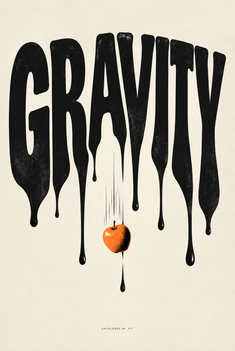
Create one finished conceptual typography poster for the exact title "GRAVITY". A single poster only: no moodboard, grid or mockup. The title is the dominant visual: huge, readable and spelled exactly. Turn its meaning into one strong visual metaphor: the letters sag and drip downward as if pulled by weight, with one small apple falling through the middle of the O. Custom letterforms whose weight, spacing and texture express the word. No other large text; a tiny catalogue line at the bottom is allowed. Off-white paper, black ink and one tangerine accent, print-quality finish.
Prompts stay in English, the language these models follow best. Copy it as it is, or change a few words.
A minimalist conceptual graphic poster pairs expressive custom lettering with clean screenprint aesthetics using GPT Image 2.5 Sunburst. The model excels here because it renders precise, correctly spelled typographic forms while seamlessly integrating a physical concept directly into the font structure.
The conceptual typography style relies on disciplined printmaking minimalism where graphic design conveys meaning instead of complex illustration.
Palette
Strictly limited to off-white paper texture, rich black ink, and a single vibrant spot color accent to mimic silk-screened editorial prints.
Composition
Hierarchical poster layout where massive, centered custom letterforms dominate the upper two-thirds, anchored by negative space and tiny editorial footer text.
Line
Clean vector-like contours combined with deliberate liquid or physical distortion that alters standard glyph geometry into figurative shapes.
Texture
Subtle matte paper grain and crisp lithographic edges that give the image an authentic, physical gallery print quality.
What defines this look
layout framing commandCreate one finished conceptual typography poster for the exact title "GRAVITY". A single poster only: no moodboard, grid or mockup.
This instruction forces the generator to output a standalone final print rather than a multi-panel design presentation or digital frame mockup.
typography hierarchy ruleThe title is the dominant visual: huge, readable and spelled exactly.
It establishes that the text itself serves as the hero illustration, preventing background noise from stealing visual focus from the word.
literal concept metaphorthe letters sag and drip downward as if pulled by weight, with one small apple falling through the middle of the O.
This defines the physical deformation of the glyphs and introduces a single narrative focal point inside the letterform.
editorial layout constraintsCustom letterforms whose weight, spacing and texture express the word. No other large text; a tiny catalogue line at the bottom is allowed.
It requests unique artistic glyphs rather than standard system fonts while restricting secondary text clutter to an authentic museum-style footer.
color and texture paletteOff-white paper, black ink and one tangerine accent, print-quality finish.
This restricts the color scheme to a stark two-tone print aesthetic with a single spot color that brings intentional graphic punch.
Same style, new subjects
Architectural Structure
Applies the typographic metaphor style to architectural forms with a bold cobalt accent.
Prompt
Create one finished conceptual typography poster for the exact title "BUILDING". A single poster only: no moodboard, grid or mockup. The title is the dominant visual: huge, readable and spelled exactly. Turn its meaning into one strong visual metaphor: the letters are constructed from solid concrete blocks with scaffolding wrapped around the letter B. Custom letterforms whose weight, spacing and texture express the word. No other large text; a tiny catalogue line at the bottom is allowed. Off-white paper, black ink and one cobalt blue accent, print-quality finish.
Fluid Current
Uses fluid motion and green spot color to demonstrate organic word distortion.
Prompt
Create one finished conceptual typography poster for the exact title "RIVER". A single poster only: no moodboard, grid or mockup. The title is the dominant visual: huge, readable and spelled exactly. Turn its meaning into one strong visual metaphor: the letters dissolve into meandering liquid currents and gentle ripples. Custom letterforms whose weight, spacing and texture express the word. No other large text; a tiny catalogue line at the bottom is allowed. Off-white paper, black ink and one emerald green accent, print-quality finish.
Thermal Heat
Applies thermal sagging distortion with a high-contrast crimson accent.
Prompt
Create one finished conceptual typography poster for the exact title "MELT". A single poster only: no moodboard, grid or mockup. The title is the dominant visual: huge, readable and spelled exactly. Turn its meaning into one strong visual metaphor: the letters liquefy at their bases as if exposed to intense heat. Custom letterforms whose weight, spacing and texture express the word. No other large text; a tiny catalogue line at the bottom is allowed. Off-white paper, black ink and one crimson red accent, print-quality finish.
Model and settings
Keep the aspect ratio at 2:3 to match standard vertical art print dimensions. Leave the resolution at 1k for quick drafting, but switch to higher output options if you intend to inspect fine paper grain or small typographic footers. The quality setting should remain on high so the model renders the edges of custom letterforms with vector-like sharpness. If adapting this design for wide banner displays, change the aspect ratio to 16:9 while keeping the layout negative space open.
Nano Banana ProPick this model when you want to add complex supporting technical diagrams or denser typographic hierarchy, as it plans graphic layouts first.
FLUX.2 ProChoose FLUX.2 Pro if you need exact brand hex codes for your accent color while maintaining clean, legible letter outlines.
When the style drifts
The image renders as a photograph of a poster hanging on a gallery wall with frames and shadows.
Strengthen the negative instruction by changing the opening to read: Flat 2D vector graphic print, pure flat surface, absolutely no frames, wall texture, shadows, or mockups.
The model adds unwanted paragraphs of placeholder Latin text and messy secondary headlines.
Replace the footer instruction with: Strictly zero secondary text, zero body copy, and zero subheadings; isolated single word only.
The letter distortion is so extreme that the word becomes unreadable scribbles.
Add the phrase: Crisp, clean, legible Swiss typography with subtle typographic distortion rather than abstract shapes.
Questions about this style prompt
How do I prevent the model from generating random gibberish words?
Specify the target word in capital letters inside quotation marks, explicitly state that it must be spelled exactly, and strictly forbid secondary body copy. OpenAI models follow explicit spelling constraints well when text demands remain minimal.
Can I swap the spot accent color to match my room decor?
Yes. Replace the phrase 'one tangerine accent' with your preferred single color, such as 'one ultramarine accent' or 'one mustard yellow accent'. Limiting the prompt to a single accent preserves the screenprint aesthetic.
Why does my poster look like a digital illustration instead of printed paper?
Make sure your prompt retains 'off-white paper, black ink' and 'print-quality finish'. These keywords tell the generator to simulate physical lithograph ink absorption and unbleached paper grain rather than glossy digital gradients.
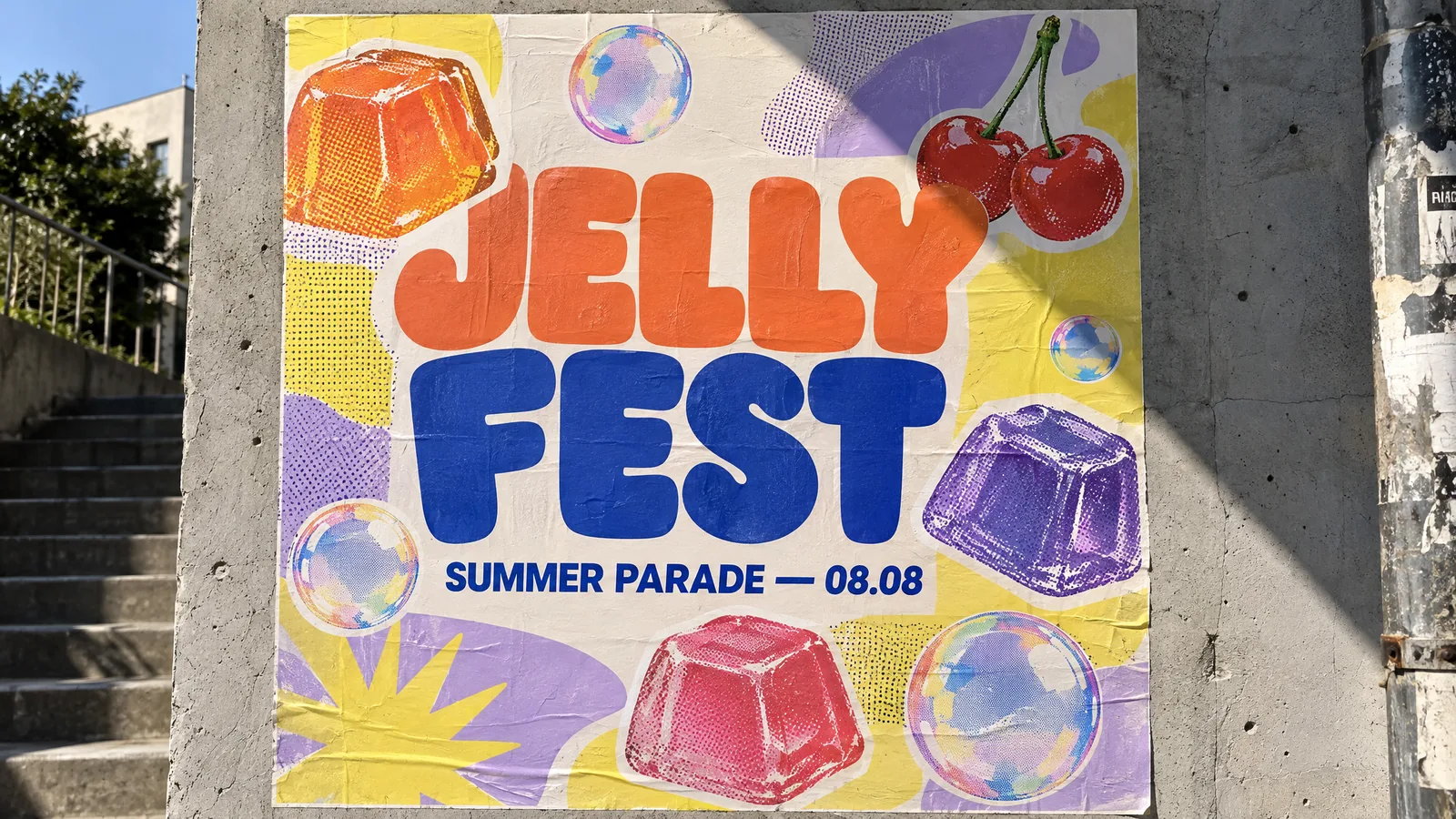
Photograph of a bold typographic event poster pasted on a sunlit concrete wall: giant chunky rounded letters "JELLY FEST" in tangerine and cobalt, a subtitle "SUMMER PARADE — 08.08" in a clean grotesk typeface, layered with cut-out stickers of wobbling jelly cubes, iridescent soap bubbles and cherries, halftone riso-print texture, lemon-yellow and lilac color blocks; harsh afternoon sun casts a diagonal shadow across the poster. Editorial graphic design, crisp legible text, no logos, no brand names.
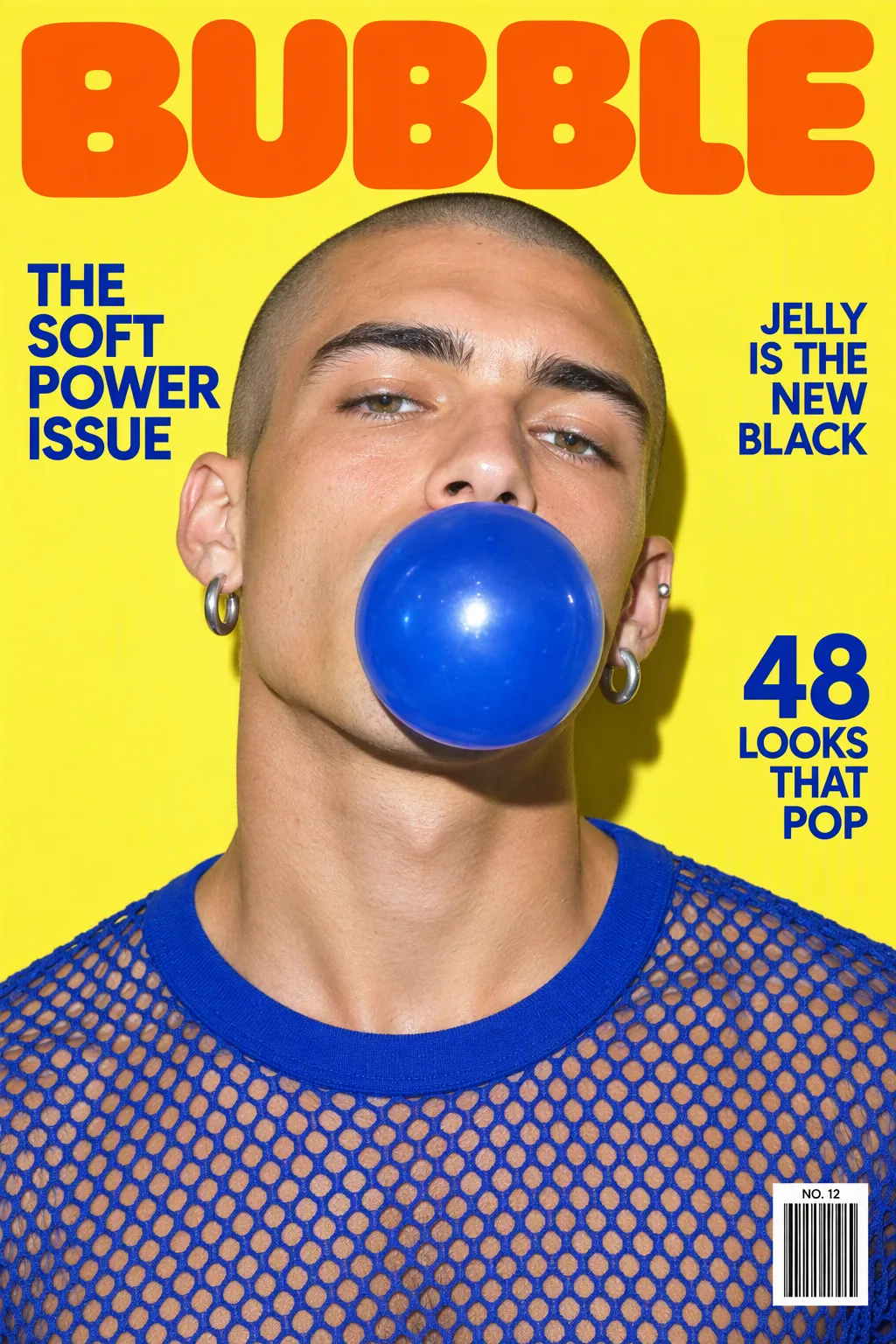
A glossy fashion magazine cover with the masthead "BUBBLE" in huge rounded tangerine letters: a man in his twenties with a shaved head, silver earrings and a cobalt mesh top blows a large cobalt-blue bubblegum bubble, shot with hard flash on a lemon-yellow background. Coverlines in a clean grotesk: "THE SOFT POWER ISSUE", "JELLY IS THE NEW BLACK", "48 LOOKS THAT POP", plus a barcode and issue number. Crisp legible typography, photorealistic print, no real brand names.
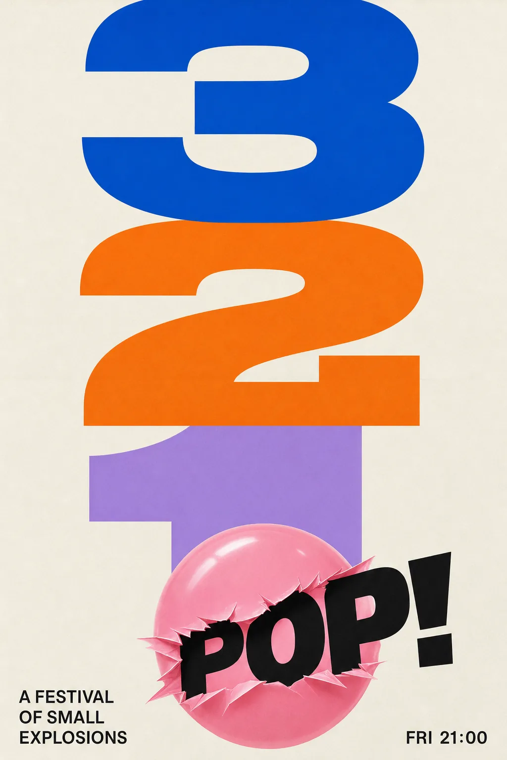
Swiss-style typographic poster: enormous bold numerals "3 2 1" stacked in cobalt, tangerine and lilac, with the word "POP!" bursting out of a glossy pink bubblegum bubble at the bottom; small clean grotesk text "A FESTIVAL OF SMALL EXPLOSIONS" and "FRI 21:00"; cream paper background, subtle paper texture, perfect grid, crisp legible text, no logos.
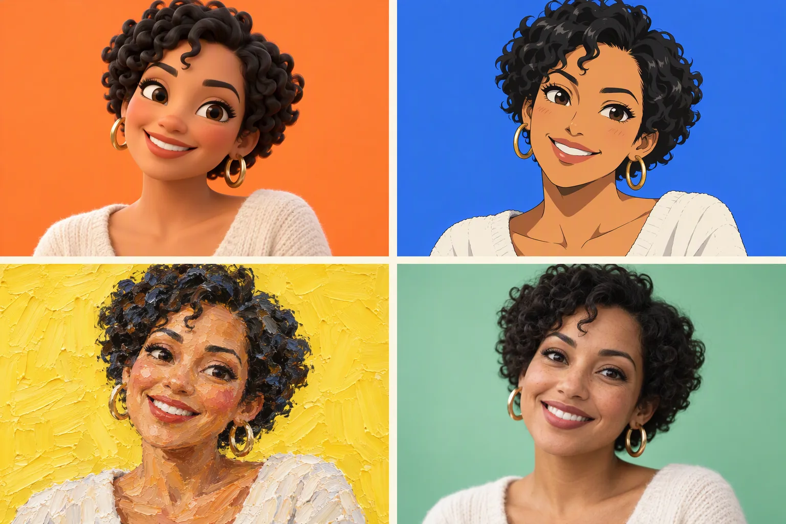
A 2x2 grid showing the same portrait of a smiling woman in her thirties with short black curly hair and gold hoop earrings, rendered in four different styles: top-left glossy 3D clay animation, top-right hand-drawn anime cel shading, bottom-left thick impasto oil painting, bottom-right photoreal studio photograph. Each panel has a different candy-colored background (tangerine, cobalt, lemon, mint), thin cream gutters between panels, no text.
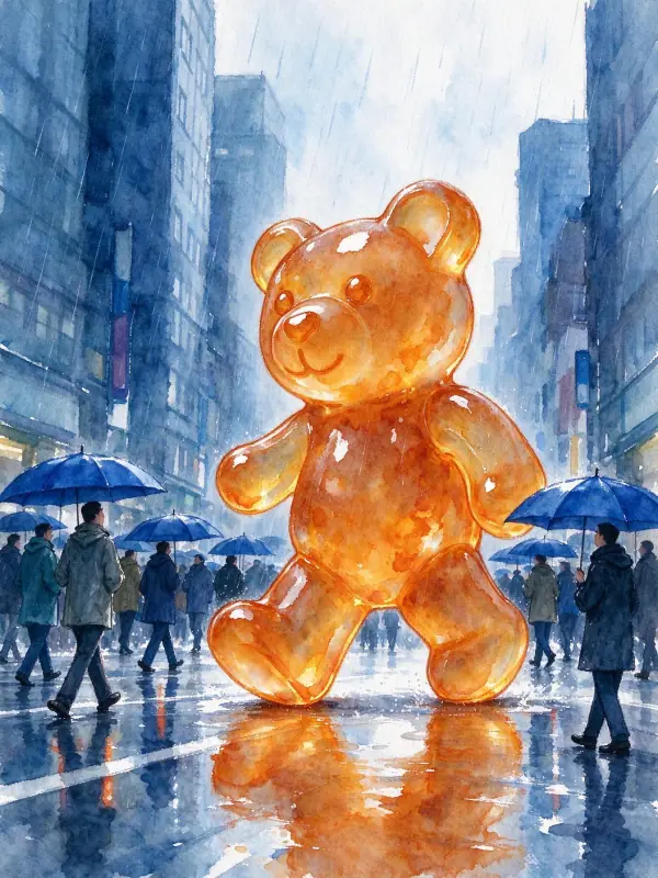
a three-story translucent orange gummy bear striding down a rainy city street while tiny people with cobalt umbrellas look up, loose watercolor illustration, wet-on-wet color blooms, visible cold-press paper texture, soft pigment edges, limited palette, generous white space, adults fully clothed, no text, no logos
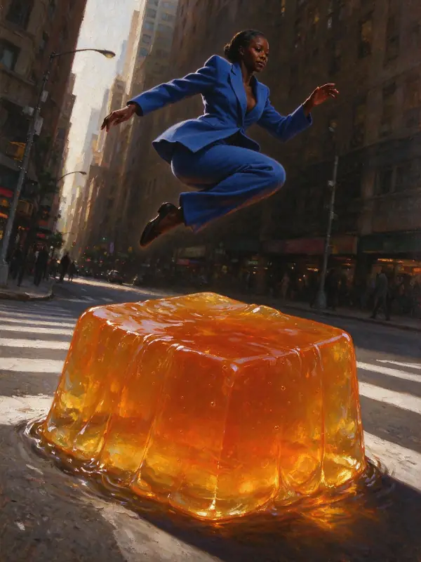
a worm's-eye view of a Black woman in an oversized cobalt suit leaping over a giant wobbling translucent orange jelly cube on a city crosswalk, classical oil painting, chiaroscuro lighting, rich glazing, visible brushwork, warm varnished tones, fine canvas texture, adults fully clothed, no text, no logos
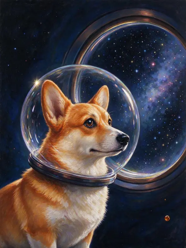
a corgi wearing a clear bubble space helmet floating past a round porthole full of stars, glossy modern oil painting, rich translucent glazes, soft blended light, warm varnish sheen, jewel-toned color against a velvet-dark background, refined contemporary portrait composition, adults fully clothed, no text, no logos
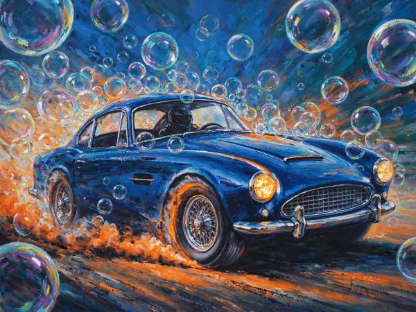
thick palette-knife oil painting of a cobalt vintage sports car drifting sideways through a cloud of rainbow soap bubbles, its tires smoking orange, sculpted ridges of paint, bold hot orange and cobalt, raw energetic texture, cropped dynamic framing, adults fully clothed, no text, no logos