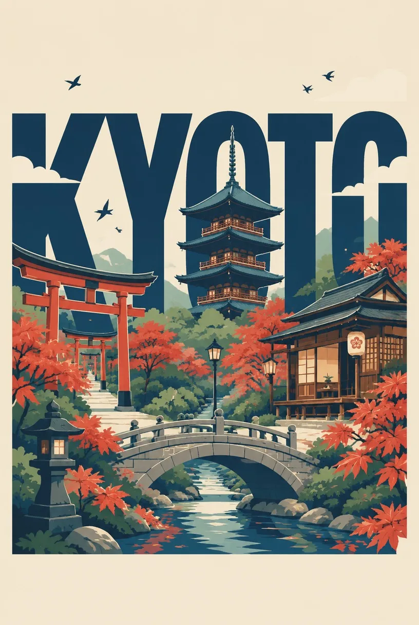
City Name Travel Poster, made with GPT Image 2.5 Sunburst
Example made with GPT Image 2.5 Sunburst

Text to imageArt & posters

GPT Image 2.5 Sunburst poster design promptCity Name Travel Poster

The exact text-to-image prompt behind this picture, made with GPT Image 2.5 Sunburst.

Fill in the blanks

Change any box and the prompt below updates. Copy it, or make one with your version.

Prompt

A clean modern typographic travel poster where the city name "KYOTO" is the composition: huge bold uppercase sans-serif letters spanning the width, with a five-storey pagoda, red shrine gates, a wooden tea house, maple trees and a stone bridge built into, around and inside the letters while staying readable. Flat vector illustration, crisp geometric shapes, subtle shadows, a limited palette of deep navy, warm cream, muted red and soft sage. Small birds, clouds and street lamps as accents.

Prompts stay in English, the language these models follow best. Copy it as it is, or change a few words.

Opens GPT Image 2.5 Sunburst with this prompt and the settings below filled in.

67 tested GPT Image prompts →

Settings

Mode
Text to image
Aspect ratio
2:3
Resolution
1k
Quality
high
Price
From 2 credits

The exact price shows before you generate.

Make your own version

  1. The words in quotes, "KYOTO", are printed in the picture. Keep them short and change them to your own.
  2. This is a fill-in template: swap the parts in braces, like {landmarks}, in the boxes above and keep the rest word for word.
  3. Change the color palette, deep navy, warm cream, muted red and soft sage, to shift the mood of the whole scene.

Where this template comes from

Adapted from a prompt by @Goodmanprotocol, collected in freestylefly/awesome-gpt-image-2 under MIT. PopNow rewrote it as a fill-in template and made the example above.

Style prompt guide

Style traits to keep

A flat vector travel poster where the city name KYOTO is the composition, with a pagoda, shrine gates, maple trees and a stone bridge built into the huge bold letters. GPT Image 2.5 Sunburst suits this job because it is built for clean text, so the letters stay readable while the navy, cream, muted red and sage palette holds across the scene.

The style depends on a few controlled, flat choices rather than fine detail. These traits are what make the result read as a vintage-style travel print.

Composition
The letters fill the full width and the scenery sits inside them, so the type is the picture. Without this, the poster reads as a scene with a caption.
Palette
Only deep navy, warm cream, muted red and soft sage appear, which gives the print a calm, vintage-travel feel. Extra colours tend to make it look busy.
Shape
Flat vector illustration with crisp geometric shapes gives hard edges and solid fills, so the pagoda and gates read as simple graphic forms.
Light
Subtle shadows add a little depth without a 3D look, which keeps the flat style intact.

What defines this look

  1. Poster concept and typeA clean modern typographic travel poster where the city name "KYOTO" is the composition: huge bold uppercase sans-serif letters spanning the width

    This sets the idea that the city name is the layout itself, not a caption. Remove it and the model may place a standard scene with the word added at the bottom.

  2. Scene elementsa five-storey pagoda, red shrine gates, a wooden tea house, maple trees and a stone bridge

    These five landmarks give the poster its travel theme and a recognisable Japanese setting. Swap one for a different landmark and the place changes; add more and the letters start to lose their shape.

  3. Letter integration rulebuilt into, around and inside the letters while staying readable

    This tells the model to fit the scenery into the letterforms rather than beside them. Without it, the scenes sit as separate blocks and the word breaks apart.

  4. Style and paletteFlat vector illustration, crisp geometric shapes, subtle shadows, a limited palette of deep navy, warm cream, muted red and soft sage

    This keeps the image graphic and calm, with hard edges and only four colours. Remove the palette and the output often picks up extra hues that make the letters harder to separate.

  5. Accent detailsSmall birds, clouds and street lamps as accents

    These small touches add life and scale without competing with the letters. If you remove them, the poster feels emptier, but the main message stays the same.

Same style, new subjects

Pet portrait

The cat and basket replace the travel landmarks, which suits a pet-themed print for a home or gift while keeping the same flat look.

Prompt

A clean modern typographic pet poster where the word "LUNA" is the composition: huge bold uppercase sans-serif letters spanning the width, with a sitting tabby cat, a red collar, a wicker basket, a potted fern and a wooden window frame built into, around and inside the letters while staying readable. Flat vector illustration, crisp geometric shapes, subtle shadows, a limited palette of deep navy, warm cream, muted red and soft sage. Small birds, clouds and paper lanterns as accents.

City street

Street-level landmarks suit a different city, and the tram and tiles keep the travel feel while the palette stays the same.

Prompt

A clean modern typographic travel poster where the city name "LISBON" is the composition: huge bold uppercase sans-serif letters spanning the width, with a tram, tiled façades, a steep stairway, palm trees and a stone fountain built into, around and inside the letters while staying readable. Flat vector illustration, crisp geometric shapes, subtle shadows, a limited palette of deep navy, warm cream, muted red and soft sage. Small birds, clouds and street lamps as accents.

Still life

Household objects give a calm seasonal theme for a kitchen or dining print, with the same flat style and palette.

Prompt

A clean modern typographic still life poster where the word "AUTUMN" is the composition: huge bold uppercase sans-serif letters spanning the width, with a ceramic teapot, three pears, a folded linen cloth, a glass jar and a wooden spoon built into, around and inside the letters while staying readable. Flat vector illustration, crisp geometric shapes, subtle shadows, a limited palette of deep navy, warm cream, muted red and soft sage. Small birds, clouds and dried leaves as accents.

Model and settings

Keep the 2:3 ratio, which suits a tall travel poster, and keep quality set to high so the thin lines and small birds stay crisp. The 1k resolution works for screen previews; if you plan to print, choose a higher resolution option, because this model is built for sharp text. Stay in text-to-image mode, since this prompt uses no start frame or input picture. For a square social post, change only the ratio and leave the rest alone.

  • Nano Banana 2.1Pick this when the letters need to be even sharper or you plan to output at 4K, since its tagline promises sharp text and 4K output for poster-style type.
  • Seedream 5.0 FlashUse this for quick drafts of the same layout before you run a final high-quality version, because it is built for fast images up to 2K.

When the style drifts

The style washes out into a generic clip-art look.
Keep 'Flat vector illustration, crisp geometric shapes' in the prompt and add 'no gradients' to stop soft shading creeping in.
The pagoda and maple trees overpower the letters, so KYOTO stops reading as a word.
Keep 'while staying readable' and remove one scene element, such as the street lamps, or add 'the letters remain the dominant shape'.
The colours turn muddy when the palette is loosened.
Keep 'a limited palette of deep navy, warm cream, muted red and soft sage' and remove any extra colour words you add.
The poster drifts into the wrong medium, such as a photo or 3D render.
Remove any words like 'photograph' or '3D render' and keep 'Flat vector illustration' at the start of the style sentence.

Questions about this style prompt

How do I make the letters stay readable when the scenery is inside them?

Keep the phrase about building the scenes into the letters while staying readable, because it tells the model the type comes first. GPT Image 2.5 Sunburst is a good fit for this since its strength is clean text, but check the KYOTO letters at full size before you use the image.

Can I swap KYOTO for another city name in this prompt?

Yes, replace the city name in the quotes and in the first sentence, then change the landmarks to suit that place, such as a cathedral for a European city. Keep the flat vector wording and the palette wording so the poster still looks like part of the same set.

Why does this prompt ask for a flat vector look instead of a photo?

A flat vector style uses crisp shapes and a few colours, which keeps the pagoda and bridge easy to read inside huge letters. A photo would add texture and lighting that compete with the type, so the flat wording keeps the poster clean.