Hand-drawn
What this tool does
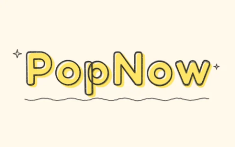
This hand-drawn text generator sketches each letter as a hollow outline traced two or three times with a slightly shaky pencil, then colors it in with a highlighter that misses the lines a little, the way you would on paper. Every letter gets its own small tilt and offset, the pencil has grain, and optional doodles add stars and a squiggly underline. Shuffle gives you a fresh take on the same word.
How to make it
- Type a heading, a name or a short phrase.
- Pick the highlighter and pencil colors, then Offset, Scribble or Swipe for the fill.
- Press Shuffle until it looks right, and download the transparent PNG.
Tips
- Wobble 2–4 looks careful; 7 and up looks like a quick doodle.
- Swipe draws one highlighter stroke behind each line, good for longer phrases.
- Marker and Script fonts work well with Scribble for a notebook look.
Good for: Study notes and bullet journals, Instagram story headings, YouTube thumbnails for vlogs, teacher slides, handmade-looking stickers.
Questions
Why does the same word look different each time I press Shuffle?+
Each letter gets a random pencil jitter, tilt and highlighter offset. Shuffle picks a new random seed; your text and settings stay the same.
Can I get just the outline without the color?+
Yes. Set Fill to None to keep only the pencil lines.
Will it look hand-drawn on a dark background?+
Use the custom pencil swatch to pick white or another light color, and keep the background transparent so it sits on top of your design.
Can I use the hand-drawn text on a photo?+
Yes. Download the transparent PNG and place it over a photo in the editor or any design app. You can also choose the Photo background option on the page to preview how it looks over a picture first.
What is the difference between the Highlighter and Pencil styles?+
Highlighter gives a bold coloured fill with pencil outlines on top, like a bullet journal heading. Pencil leans toward the sketched lines. Try both on the same word and compare, since Shuffle keeps your text.
Why is my text hard to read?+
The usual causes are high Wobble, a long phrase or low contrast between the colours. Lower Wobble to between 2 and 4, shorten the text, or pick a darker pencil colour to make it clearer.
Can I animate the hand-drawn text?+
The tool exports a still PNG. You can place that PNG on a clip in the video editor, which lets you add the heading to a video.
Do I need an account to download?+
The page labels the tool as free and says nothing is uploaded. You can type, shuffle and press Download PNG directly on the page.
Go deeper
Before and after: what changes
This tool turns plain typed text into a heading that looks sketched by hand. Because it starts from typed words rather than a photo, the comparison is between a clean font and the same word with pencil lines and a highlighter fill.
- What changes
- Solid, perfectly even letters become hollow pencil outlines with a slightly uneven highlighter fill behind them. Each letter also gets its own small tilt and offset, so the word no longer sits on a straight line.
- What stays the same
- Your spelling, the letter order and the overall length of the word do not change. The text remains fully readable, and the transparent background lets it sit on top of any design.
- What to look at when you compare
- Check that the highlighter colour contrasts with the pencil colour and with your final background. Then look at the gaps between letters, because high Wobble or Offset settings can make neighbouring letters crowd each other.
Text that works, and text that doesn't
Works well
- Short headings of one to four words, such as a subject name or a section title, give each letter room to show its pencil outline.
- A highlighter colour that is clearly lighter or brighter than the pencil colour keeps the outline visible on top of the fill.
- Marker or Script fonts with Scribble fill give a convincing notebook look because their strokes already feel loose.
Avoid
- Very long sentences shrink the letters, and the pencil grain and doodles turn into noise that is hard to read.
- Pale pencil and pale highlighter together on a white page make the text nearly disappear.
- Maximum Wobble on a small word can tilt letters so much that it becomes hard to read at a glance.
Step by step
- Type your textEnter your heading in the Your text box. Keep it short, since the effect looks best when each letter is large enough to show its outline.
- Choose a style and fontPick Highlighter or Pencil under Style, then choose Round, Marker or Script as the Font. Round is the most readable, while Marker and Script feel more like handwriting.
- Set the fill and wobbleChoose Offset, Scribble, Swipe or None under Fill, then adjust Wobble to control how shaky the lines are. Set the Doodles count if you want stars and a squiggly underline around the word.
- Pick colours and backgroundSet the Effect Color and choose Transparent or Photo as the Background. If the text will go on a dark page, choose a light pencil colour first.
- Shuffle, check and downloadPress Shuffle a few times and zoom in on the edges of the letters and on the doodles. When the word is readable and the colours are clear, press Download PNG, or use Send to to carry it on to another tool.
How the effect works
- Pencil outline
- Each letter is traced as a hollow outline two or three times with small random shifts. This layering is what gives the shaky, sketched look.
- Highlighter fill
- The fill is drawn separately from the outline, so it can slip past the lines slightly. Offset, Scribble and Swipe change how that colour is laid down.
- Random seed
- The jitter, tilt and offset all come from a random seed. Shuffle changes the seed, so the same settings can give a different result.
- Runs in your browser
- The page states that nothing is uploaded, so the text is drawn locally and the result is ready to download straight away.
Where to go next