
家族の紋章の作り方は、盾、対照的な2色、家族の大切な価値観を表すシンボルを選び、短いモットーを添えることです。PopNow の紋章メーカーは、その選択からダウンロードできるオリジナル作品を描きます。姓に結び付いた歴史上の紋章を検索する機能ではありません。
家族の紋章とは?各部分にはどんな意味がありますか?
日常では全体を family crest と呼ぶこともありますが、紋章学の crest は兜の上の飾りを指し、盾には arms が描かれます。スコットランドの紋章機関 Court of the Lord Lyon の Crests 案内もこの区別を説明しています(2026年10月29日閲覧)。紋章の概要では、各部分の位置関係を確認できます。
中心となるのが盾、背景がフィールド、その上の図形がチャージです。ティンクチャーには紋章の色、金属色、毛皮文様が含まれます。モットーは短い言葉で、巻物状の帯に入れることが多く、自分の言語でも構いません。明快な現代の家族のシンボルに、兜、左右の動物、ラテン語の文は必須ではありません。
College of Arms の Resources ページは、紋章は特定の個人や家系に属し、姓全体に属するものではないと説明しています(2026年10月29日確認)。姓の検索は調査の出発点であり、同姓の全員がその紋章を使える証拠にはなりません。以下の3例は架空の家族設定で、祖先とのつながりを主張しません。
意味のあるシンボルと色はどう選びますか?
- 価値観を1つ書きます。 学び、粘り強さ、冒険などの言葉で方向を絞ってから、装飾を選びます。
- 中心のチャージを1つ決めます。 本は読書好きの家族、オークは根、船は旅を表せます。これは新しい作品に自分で与える意味で、歴史上のすべての紋章に共通する暗号ではありません。
- 色の対比をつけます。 金と銀は主な金属色で、通常は黄と白で表します。青、赤、緑、黒、紫は色に分類されます。まずは色のある地に金属色のチャージ、またはその逆を置くと分かりやすくなります。ティンクチャーの慣例)には体系と例外の説明があります(2026年10月29日閲覧)。
- 配置をシンプルにします。 分割しない地に大きなシンボルを1つ置くところから始めます。複雑な盾は大きな画像では映えても、小さなカードでは判別しにくくなります。
PopNow は象徴の候補を示しますが、家族の紋章の意味は自分の説明から生まれます。贈り物なら「一緒に育てる家庭の象徴として、オークを選びました」と一言添えましょう。緑の盾には常に同じ意味があるという一覧よりも、気持ちが伝わります。
PopNow ではどうやって紋章を作りますか?
- 形と色を設定します。 盾、地の色、分割を選びます。ヒーター型は下端が尖り、分割なしは1つの地になります。シンボルの色は自動のままにすると、対比のある色から始められます。
- シンボルと言葉を加えます。 メインシンボル、盾の上、任意で盾を支える動物を選びます。モットー(座右の銘)では既存の言葉か自由に入力を使い、名前の帯には家名(任意)を入力します。名前もモットーも短めにします。
- 仕上がりを選びます。 クラシックは紋章画風、モダンフラットは簡潔な図形、版画風は黒いインク表現です。その他の設定では GPT Image 2.5 Sunburst が既定のモデルで、画質は HD、解像度は2Kです。
- 作成して確認します。 紋章を作るを押す前に、ボタンの価格を確認します。名前とモットーを1文字ずつ読み、シンボルと盾全体が収まっていることを確かめてから保存します。
以下の3作品は2026年10月29日、ツールと同じプロンプト作成関数を使い、GPT Image 2.5 Sunburst、レンダリング品質 medium、2K、正方形で生成しました。ブラウザ操作の画面写真ではなく、同じ選択内容でモデルを直接呼び出したものです。カードには実際の指示とパラメータを残しています。ベクター風の紋章でも、出力はラスター画像です。
オリジナルの家族の紋章3例はどんな仕上がりですか?
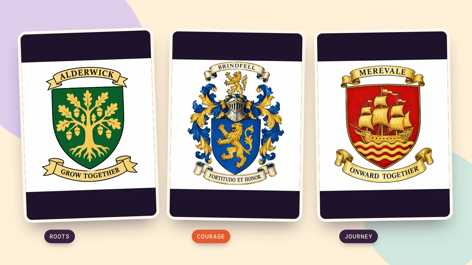
Alderwick:根を張り、共に成長する
架空の Alderwick 家では、オークの木、緑(ヴァート)、分割なし、盾の上と左右の装飾なし、モダンフラットを選びました。金のオークは育てたい根を表し、GROW TOGETHER は自作のモットーです。これは創作の説明で、実在の Alderwick 家の歴史とは関係ありません。最初の画像は兜と左右の動物が追加されたため不採用にし、要素を追加で装飾を除くよう指定しました。採用した画像は簡潔になりましたが、フラットの指示にもかかわらず多少の陰影が残っています。
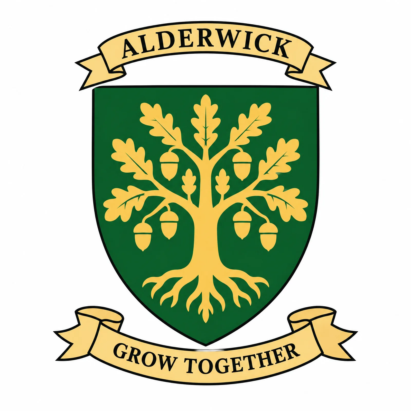
A flat 2D vector logo of an original heraldic coat of arms, drawn as a minimal modern flat vector emblem, like a crisp logo: simple geometric shapes, thick even outlines, flat solid colors only, no gradients, no shading, no texture and no fine detail. The shield: a classic heater-shaped shield (flat top, curved sides meeting in a point at the base), a single field of green (Vert). The main charge, centered on the shield and filling it well: an oak tree with spreading branches and acorns in gold (Or). Nothing above the shield. Lettering: a small ribbon above everything that reads exactly "ALDERWICK", and a flowing scroll banner below the shield that reads exactly "GROW TOGETHER" in clean classic serif capital letters; spell every word exactly as written, and no other words, letters or numbers anywhere. Keep every part, including the helm, mantling and supporters, in the same flat minimal icon style with at most five flat colors: no shading, no highlights, no texture, no gradients, no fine detail, no realistic metal. Perfectly symmetrical, centered composition with the whole emblem fully visible and a generous margin around it, crisp clean edges, on a plain pure white background with no shadow, no scenery, no border and no watermark. Also: Only the shield and two lettering ribbons; omit helmets, mantling, side animals and all ornament. Use solid flat fills with no shading.
Brindfell:伝統的な仕上がりで勇気を表す
架空の Brindfell は、青(アジュール)の地に金のライオン、クラシック、兜を使っています。ラテン語の Fortitudo et honor は、ツールの力と名誉に対応するモットーです。ここではライオンに勇気の意味を持たせ、青と金の対比で中央を見やすくしました。兜の上の小さな図形が、狭義の crest です。
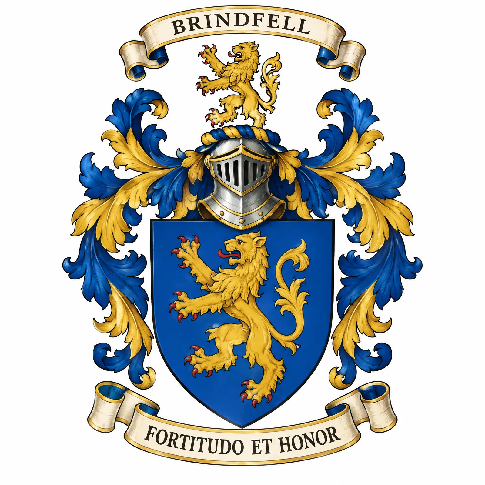
An original heraldic coat of arms, drawn as a classic, richly detailed heraldic painting: bold black outlines, flat heraldic colors with subtle shading and gold highlights. The shield: a classic heater-shaped shield (flat top, curved sides meeting in a point at the base), a single field of blue (Azure). The main charge, centered on the shield and filling it well: a lion rampant (standing on its hind legs, facing left, claws raised) in gold (Or). Above the shield, a steel knight's helm facing forward, with flowing leafy mantling in blue (Azure) and gold (Or) spreading down both sides of the shield, and a small lion rampant as the crest on top of the helm. Lettering: a small ribbon above everything that reads exactly "BRINDFELL", and a flowing scroll banner below the shield that reads exactly "Fortitudo et honor" in clean classic serif capital letters; spell every word exactly as written, and no other words, letters or numbers anywhere. Perfectly symmetrical, centered composition with the whole emblem fully visible and a generous margin around it, crisp clean edges, on a plain pure white background with no shadow, no scenery, no border and no watermark.
Merevale:共に進む旅
架空の Merevale 家では、赤(ギュールズ)の地に船、分割なし、クラシックを選び、盾の上と左右には装飾を付けませんでした。ONWARD TOGETHER が共に旅するテーマを伝えます。装飾を省くと船と文字に広さを使えますが、実物を印刷注文する前に、帆と帯を一つずつ確認してください。
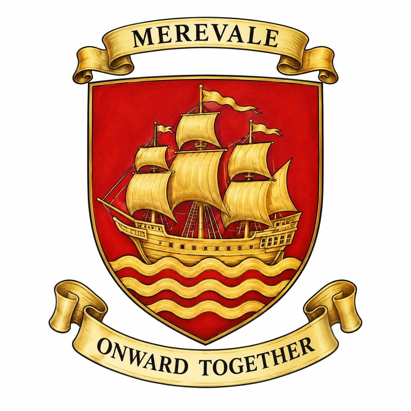
An original heraldic coat of arms, drawn as a classic, richly detailed heraldic painting: bold black outlines, flat heraldic colors with subtle shading and gold highlights. The shield: a classic heater-shaped shield (flat top, curved sides meeting in a point at the base), a single field of red (Gules). The main charge, centered on the shield and filling it well: a sailing ship with full sails on stylized waves in gold (Or). Nothing above the shield. Lettering: a small ribbon above everything that reads exactly "MEREVALE", and a flowing scroll banner below the shield that reads exactly "ONWARD TOGETHER" in clean classic serif capital letters; spell every word exactly as written, and no other words, letters or numbers anywhere. Perfectly symmetrical, centered composition with the whole emblem fully visible and a generous margin around it, crisp clean edges, on a plain pure white background with no shadow, no scenery, no border and no watermark.
モデルの比較と完成画像の活用はどうしますか?
同じプロンプトでモデルを比較するなら、盾、文字、縦横比を変えずにモデル比較を使います。別の選択肢である Nano Banana 2.1 の2K画像生成は 72クレジット です。この記事では別モデルでの追加テストを行っていないため、この作例から順位は付けられません。Sunburst の価格は解像度だけでなく品質と縦横比でも変わるため、実際の生成ボタンで見積もりを確認してください。
通常の印刷には白背景の PNG を保存します。背景を透明にを使う場合は、縁を確認してから透過 PNG を選びます。旗、マグカップ、印章指輪はブラウザで合成したプレビューで、現物販売や彫刻の細部の保証ではありません。まず小さく試し刷りしましょう。家族の象徴よりも本人らしいプロフィール画像が目的なら、プロフィール画像メーカーから始める方が直接的です。
よくある質問
家族の crest とは何ですか?
日常語では家族の紋章全体を指すことがありますが、紋章学では兜の上の飾りを意味します。盾とチャージは全体の構成の別の部分なので、制作を依頼するときはどの部分を指すのか伝えると役立ちます。
自分の姓に対応する紋章はありますか?
姓だけでは特定の紋章を使う資格の証明にはなりません。適切な紋章や系譜の資料で、関係する人物、地域、記録された血統を調べてください。このメーカーは新しい画像を作るもので、歴史上の登録を検索したり紋章を授与したりはしません。
紋章のシンボルにはどんな意味がありますか?
意味は個々のデザインと歴史によります。新しい装飾用の紋章では、本は学び、オークは根、船は旅など、説明できる結び付きを選べます。それを、歴史上の全例に当てはまる固定的な定義として扱わないでください。
ラテン語ではなく英語のモットーでも作れますか?
はい。自由に入力で印刷したい言葉を入れるか、既存の言葉の表記を英語に切り替えます。自分で入力した文は自動翻訳されず、そのまま描かれます。短く明快な言葉の方が、読みやすい文字のための空間を確保できます。
紋章の作成にはいくらかかりますか?
選んだモデルと設定に応じた見積もりが生成ボタンに表示されます。この記事のカードは Sunburst、品質 medium、2K、1:1 です。背景削除とモックアップの合成はローカルで行い、追加料金はかかりません。別の印刷業者に支払う前に、元ファイルの文字を確認してください。